
One of the most sought after stamps both for their rarity and simplicity of design.
As the overprinted French stamps were completely exhausted it was decreed that provisionals be printed and exclusively used in Diego-Suarez. This need probably accounts for the simple design.
Lithographed on white paper.
The ink color is greyish not black and generally shows many white spots due to lack of coverage from the ink used.
Catalogs of the period note the following quantities initially produced, sold and destroyed.

Critics of the period did not give this issue favourable opinions
“Not content with the quartet of horribles inflicted upon us last year, the authorities have just issued a new provisional of local workmanship. "A very sad stamp" is a free translation of M. Moens' comment concerning it.
We think our readers will agree with him.
Overall, information on this issue is very limited and little more than a few blocks exist as multiples. I have not seen or heard of any plating efforts and generally catalogs have forgeries or facsimiles as examples.
These stamps appear to be readily available on both reliable and common online sites but the vast majority are forgeries. Even “signed” stamps need to be viewed with caution.
Genuine Stamps and Features

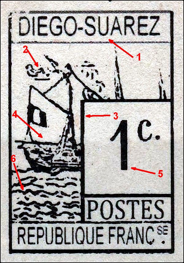
1. The G is higher than the other letters
2. The S has a larger lower section
3. The U is above the S and inclined slightly to the right
4. The A is tall and the right leg is longer
5. The is a larger space between the EZ
6. The top of the Z is shorter than the bottom
7. Note the shape of the clouds
8. The mast and rope are open
9. Note the thickness of this line, some forgeries have a much thicker line
10. Note the thickness of the 1 as well as the long serif which has a slight curve. The right side of the foot is thicker than the left side
11. The S in POSTES is the tallest letter and the top of the T is slightly inclined.
12. Note the thick wave under the ship
13. This wave connects with the ship
14. Note the shape, quantity and direction of the large and small waves.
15. The A is tilted to the left
16. There appears to be 1 or 2 passengers here
All these traits may not apply in every stamp

2. The right side of the U is taller
3.The Z is tall and the top is shorter than the bottom
4. The G has a pronounced serif
5. The middle bar of the A is inclined and the right leg is much more inclined
6. There are 4 thick bars here
7.There are 2 openings in the hair lines
8. The hair lines all touch the frame
9. Note the length of the tear drop
10. Note the relative thickness of the frame lines
11. Note the shape and size of the ball
12. Opening here
13. The P has an even serif
14. The O is thin at the top and bottom
15. The E has a larger lower serif
16. The tail of the Q is straight and does not touch the frame
17. Note the shape and size of the SE
18. The dot is close to the letter
19. Note the shape of the cedilla and in particular the right angle.
All these traits may not apply in every stamp

2. The middle bar is straight
3. The Z is not as tall as the E and is shorter on top
4. Note the shape of the hair lines
5. 10 lines here
6. Note the size and shape of this line
7. The 1 has a long slightly curved serif
8. Note the thickness of the frame lines
9. The right foot of the 1 is thicker than the left side
10. The O has a thin top and bottom with the top appearing flat
11. Note the shape & size of the SE
12. The dot is very close to the letter and the cedilla is not well defined
13. The top of the S is much smaller than the bottom
14. The tail of the Q is short and thick
All these traits may not apply in every stamp

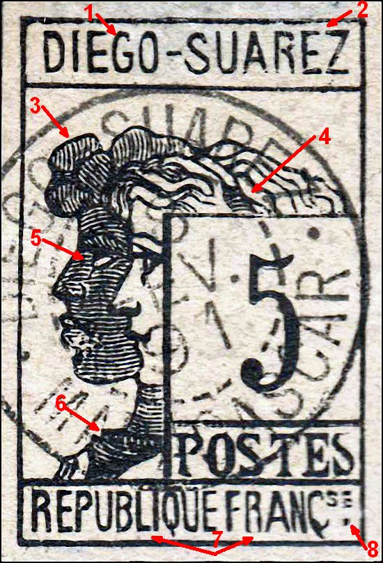
1a. The D has a the shape of a 0
2. The bottom leg of the E is longer
3. The O is taller than the other letters
4. Note the thick shading
5. The middle bar of the A is slightly inclined
6. Pointed helmet with blotchy shading lower right
7. 8 distinct lines
8. The tip of the 5 is rounded
9. This hair line does not touch the frame
10. The end of the 2 is flat
11. Note the thickness of the frame lines
12. The O is thin top and bottom
13. Prominent serifs on the S. Note also that the letters taper in height from left to right
14. The S is larger than the E
15. The cedilla in distinct and has a right angle, The dot is close to the letter and generally dash shaped
16. The L has a slight incline
Forgeries
 |
| Francois Fournier |
There were 2 main forgers who account for the majority of offerings online and both executed very good examples.
The first is the well known François Fournier (shown right) and the second is the less known Poirier
Mr. Poirier was superintendent of the post office in Diego Garcia.
He created many forgeries after the original stamps he had in his custody.
His stamps after a photo which he then reproduced on a lithographic stone like the originals.
Many were cancelled with the genuine cancel.
It was only some years later that philatelists in Paris discovered the existence of these Forgeries but then it was too late as the stamps were already found in collections everywhere.
Aside from these 2 forgers there are indications that several more were involved to a lesser extent.
Fournier Forgeries
I am only highlighting the main features. Differences exist in the waves and the ship

1. Thick frame line
2. Foot thicker on left side
3. T not taller than the E
4. S much larger than the E
5. Wave does not touch the ship
6. Waves have thick lines
1. The G has a rounded back
2. The top of the E is not inclined
3. No breaks in the hair
4. Too many lines
5. The shading lines have no breaks
6. No opening here
7. Several letters are shaped differently and some are too high
8. The dot is too close and the cedilla is poorly shaped
2. The top of the E is not inclined
3. No breaks in the hair
4. Too many lines
5. The shading lines have no breaks
6. No opening here
7. Several letters are shaped differently and some are too high
8. The dot is too close and the cedilla is poorly shaped

1. G lacking serif
2. Middle bar is inclined
3. Top of the Z is too small
4. Dragon has a different shape
5. Lines are very different
6. The tear drop is inclined the wrong way
7. Too many small dashes
8. Short serif
9. Large C and dot in wrong place

1. D has more proper shape
2. The U has a wide opening
3. The top of the E is too long
4. No dark shading
5. Round tip instead of pointed
6. Too many lines
7. Hair strands different
8. End of 2 is pointed instead of flat
9. Small top on S
10. Tail touches frame
11. Cedilla wrong shape and touches the frame
2. The U has a wide opening
3. The top of the E is too long
4. No dark shading
5. Round tip instead of pointed
6. Too many lines
7. Hair strands different
8. End of 2 is pointed instead of flat
9. Small top on S
10. Tail touches frame
11. Cedilla wrong shape and touches the frame
A Fournier block - often found in auctions and rarely in line with the catalog value

 |
| From the original Fournier books in Geneva |
Poirier Forgeries

1. G is wide
2. Middle bar is not inclined
3. Middle bar is too high
4. No opening here
5. Thin 1
6. Wave does not touch ship and the vertical line is a common trait
7. Line is similar to original
8. T has a wide top, also the S is much smaller than in the original
9. Waves have different shapes
10. Tail is too long

1. Only one break instead of 2
2. Probably a short 4th line hidden by cancel
3. Thick line and thin right frame
4. Letters different shape and the O is inclined
5. No opening here
6. E is poorly shaped
7. The dot is too small and many letters are crudely formed

1. Dragon is different
2. Dots have no white centers
3. Hairline is very different
4. Thick frame
5. Too many lines
6. Tear drop different
7. Both S are high
8. E has a high curl
9. Short hairline

1. Dragon is different
2. Dots have no white centers
3. Hairline is very different
4. Thick frame
5. Too many lines
6. Tear drop different
7. Both S are high
8. E has a high curl
9. Short hairline
Poirier Block of 4

Unknown Forgers

Does not match the other forgeries
1. Tall A in SUAREZ
2. The first bottom R is oddly shaped as is the second E
3. The tops of the EZ are bent downwards
4. The right side of the 1 foot is noticeably thicker
5. First bottom E is slightly inclined
6, The C is very tall

1. The G is very large
2. The lines do not touch the frame
3. Very long serif
4. The C is inclined
5. The E is tilted
6. The wave lines are different
2. The lines do not touch the frame
3. Very long serif
4. The C is inclined
5. The E is tilted
6. The wave lines are different
This one has a modern look
1. The letters are all very even and in a different font
2. Different clouds
3. Thick uniform frame line all around
4. The ship is very crude
5. No foot on the 1
6. Crude wave pattern

This might be a modern forgery also
1. Narrow O and the S is large
2. Normal frame line
3. Hairlines do not touch the frame
4. No opening
5. O is very high
6. Short R
1. Narrow O and the S is large
2. Normal frame line
3. Hairlines do not touch the frame
4. No opening
5. O is very high
6. Short R

2. Dragon very different
3. Large dots in the wrong position
4. Frame line touches other lines
5. Long tear drop
6. Very thick frame
7. 5 is above the 1
8. Frame line curved
9. Tall T with missing foot
10. Large head on the P

This is most certainly a modern forgery
Letters and frames are all "perfect" and a different font
It might be a cutout of some type.

This seems unlikely as they are obvious forgeries
Probably a bogus set.
They are similar to the Samuel Taylor bogus color issues

I have some suspicions that this is a Torres production
His forgeries tend from good to very crude
 This last set has a modern look

The letters are all very uniform
The fake cancel is very odd
Cancels
Fake cancels abound in this issue especially the Fournier forgeries with cancel
"DIEGO SUAREZ MADAGASCAR 15 MARS 90"
"DIEGO-SUAREZ 15 MARS 90 MADAGASCAR"
"DIEGO SUAREZ 28 SEP 91 MADAGASCAR"
"DIEGO SUAREZ 27 SEP 90 MADAGASCAR"
"DIEGO-SUAREZ 1 SEPT 92 MADAGASCAR"
"DIEGO-SUAREZ 3 OCT 90 MADAGASCAR"
Others certainly exist.


