Escuditos
1862, January 11
Printed by: Banco y Casa de Moneda de Buenos Aires without watermark.
Lithographed on plain white thin paper, imperforated
Designred by Roberto Lange
Plate: 70 stamps (7 x 10)
WITH TILDE ON THE "U" OF REPUBLIC
5c rose, 10c green, 15c blue in a wide variety of shades and varieties
The 15c pos 08 is a tete-beche and very expensive ($75M)
NOTE position 51 of the 15c has no tilde
WITHOUT TILDE ON THE "U" OF REPUBLIC.
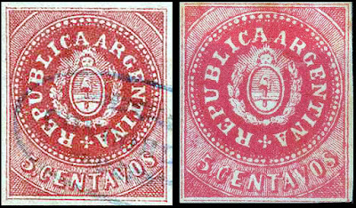
5c rose
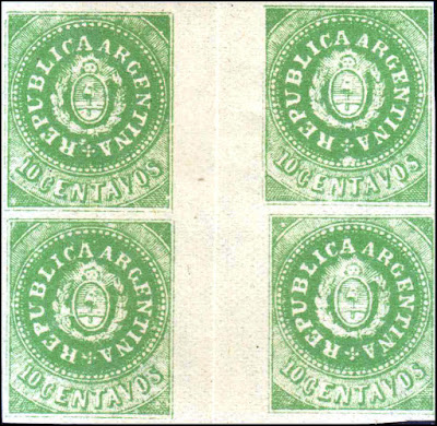
10c green
The 10c has many plate varieties
1864, January
5c - narrow ."C" in CENTAVOS
Genuine stamps
 |
| Originals with accents on the U |
NOTE many authors maintain that all the genuine stamps have 72 pearls in the ring and 11 horizontal lines in the shield. This is not the case.
 |
| 5c with and without accent on U - 74 pearls & 14 lines |
 |
| Scarce lilac color and worn plate |
 |
| 10c with and without U accent - 78 pearls and 14 lines |
 |
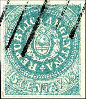
| Color variations of the 15c - 71 pearls & 14 lines |
Missing accent is a good reprint/forgery indication
 1864 issue with narrow C - 72 pearls & 11 lines (same as most reprint/forgeries would have)
This one is a real challenge as the general features do not all match the previous issues
Note the pointed A's as example, The top of the 5 is longer and curved
This Roberto Lange design is almost identical to his "reprints" that would follow.
Authentication is required
Different authors have noted that the number of pearls and lines of forgeries are:
72.,10
72, 11 (main one I found)
73, 11
79, 11
80, 11
81, 11
Genuine Features

1. A's have flat tops
2. The rays are distinct
3. The R has a lump in the leg and it extends below the letter
4. The bottom arm of the E is shorter with a much smaller serif
5. The lower curve of the S is wider
6. The right arm of the V is much thinner
6a. The ends of the decoration are generally not attached to the center dot
7. The right leg of the N is shorter than the left one
8. The lower arm of the E is longer
9. A distinct dash that often appears as a large dot on the forgeries
10. The top of the 5 is straight and short
11. The arm and hand are distinct
12. The veins in the leaves are visible unless the die is worn
13. The cap is distinct with oblique lines on it
Lange reprint/forgeries
 All are 72 pearls and 11 lines in the shield

Sperati
 |
| All 72 pearls & 11 lines |
 |
| Lange varieties |
 |
| Lange gutter pairs |
 |
| 1864 genuine left, Lange forgery right |
 |
| Lange 1864 narrow C forgery/reprint |
Raoul Ch. de Thuin Forgeries
Raoul Ch. de Thuin was a philatelic forger in the mid 20th century.
He was born in Belgium, but he moved to Mexico in 1931 where he became naturalized Mexican.
He had his own stamp shop (Maya Shop), but also operated under different names: 'Gilda Rivero Mendozo', 'Thelma Salazaar', 'R.G.Knapen', 'Belgian Export company' and 'French Philatelic Agency'
He made many forgeries (mainly forged overprints on genuine stamps, turning them into rarities) of many countries, but he seems to have specialized in South America and specially Mexico.
These are almost identical to the Lange which he probably copied later
The small face is different and the position of the CE
The numerals are different. The C is slightly lower, the 0 in 10 is higher and the 5 in 15 has a longer top
Fournier
He probably sold those of Lange. These appear in his catalog. All 72 pearls, 11 lines
As expected, he made an excellent copy of the 15c
It is a scarce item with high CV

These are the features to look for

 Another Sperati with fake cancel
The 2 below have 75 pearls and 10 lines. The AAR is joined together. The face is large and very similar to Torres Uruguay forgeries
Unknown sources
These have different numbers of pearls and lines
 |
| 74 pearls and no shading |
 |
| 81 Pearls and 11 lines, The 5 is curved |
 |
| 75 pearls and 10 lines, Face similar to Torres Uruguay |
The 2 below have 75 pearls and 10 lines. The AAR is joined together. The face is large and very similar to Torres Uruguay forgeries


The difference is very noticeable when compared to the original on the left below

Addendum
 |
| Kneitschel advertising label 1950's |