In 1845, Finland was among the first countries to issue stamped envelopes.
In 1850, the design of the stamp impression was changed to an oval shape and placed on the back flap of the envelope.
On March 1 1856, the first adhesive stamps were issued, similar to the oval impression of the stamped envelopes.
The astute Finns saved some kopeks by searching around for old used envelopes on which the oval stamp had not been cancelled (the post office people had not felt it necessary to cancel these stamps since they were part of used addressed envelopes)
They cut them out and re-used them as postage stamps instead of buying the new adhesives. |
| 1850 Cutouts |
These cut-outs did not have the “secret marks” but with cancels were not easily spotted and can still be found in many collections and auction sales as the 1856 types.
NOTE also that there are no pearls in the post horns.
The earliest known usage of a regular 1856 Oval issue stamp is March 3, 1856.There are many varieties of this issue particularly in paper and gum. One can find polished, thin, hard and rough paper in thickness varying from 0.05 mm to 0.13 mm. The paper can be white, greyish, yellowish and rarely bluish.
The gum can be without, colorless, yellow, with air bubbles or with brown spots that can be seen through the paper.
Given the high CV’s, very few will ever own an original and the majority in older collections and most if not all online are forgeries or reprints
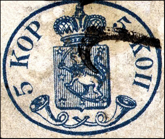
1856 5K
There are 2 basic types depending on the size of the pearls and mainly the left one.
Type I small left pearl
Type II large left pearl
 |
| Type I & II |
Genuine features1. Secret mark between the shield and the crown looks like a rough white diamond
2. The mouthpiece of the left posthorn is over the right one
3. 8 + 8 pearls in crown
4. Dots after 5’s and KOP-words are diamond shaped
5. Height 24.7 - 24.8 mm.
6. Width 28.2 - 28.4 mm.
7. Width of the shield 9.8 - 10 mm.
NOTE the lion head direction and shape, very few if any forgeries get this right
Also the relative position of the letters and the distance of the posthorns to the shield
Forgeries
There are many factors that distinguish forgeries but a key feature is “Ink Squeeze”
As the originals were made by letter press the pressure tends to squeeze out
the ink to the edges of the design.
As most forgeries are produced by lithography, they will not have this feature.
As well the pressure might make the design more visible from the rear.
Other forgery factors include;
Many 5 kop forgeries are missing at least one dot of the four in the “5 KOP” text.
Many forgeries were printed with guide lines between the stamps to facilitate cutting them.
Lithographed on white paper
1. Dot after first 5 is missing
2. The lion has a solid arm and the head is turned upwards
3. The cross is very different.
4. Secret mark is included
Possibly Torres
Forgery Type II
Lithographed on wove paper
1. The oval is flattened
2. All dots are missing
3. Cancellation unknown in Finland
4. Too many pearls on the crown
5. Very odd face on lion
6. The mouthpieces are small
7. No secret mark under the crown
May have originated with Spiro or most likely Fournier
Lithographed on white wove paper
1. Secret mark is missing
2. The Russian P letter is joined at top and bottom
3. The lion is looking up
4. No secret mark under the crown
5. The "dots" are round not diamond shaped
6. Top of the 5 is upturned
Lithographed on greyish paper.
1. The oval has a wrong shape
2. Tiny pearl only in left posthorn
3. The posthorns have wrong shape
4. Value on the right side is too far down
5. The shield shading is very heavy
Forgery Type V
Lithographed on greyish paper.
1, Mouths of posthorns wrongly over each other, the right hand mouthpiece above the left
2. The Russian P letter is as the Roman II, not joined at top
3. The 5’s have a pronounced top curve
4. The secret mark is small
Lithographed on white wove paper
1. Secret mark is missing
2. Dot only after Russian KOP
3. Russian P joined at bottom and top
4. Only six stars in coat of arms
5. Very thick letters and frame
Possibly produced by Torres
Lithographed forgery on thick (0.10) glazed paper.
1. Secret mark is missing
2. Dots are round
3. The mouth of the right posthorn is over the left
4. Tiny pearls in the posthorns
5. Oval is flattened
Forgery type VIII
Lithographed on med. thick (0.08) paper.
1. Secret mark is missing
2. Pearls are missing from posthorns
3. Small Muzzle on the lion
4. Odd shaped stars
Lithographed on white ordinary paper
1. No secret mark
2. Pronounced top curves on 5’s
3. Lion has dog face
4. Right posthorn touches shield
Another possible Torres
Very primitive forgery. White wove paper, lithographed.
1. Dots are round
2. There seems to be a "pearl" in the right posthorn
3. The Lions tail is like an ampersand
4. The colour is too blue
5. All recorded copies are cancelled with pen strokes
Forgery Type XII
Typographed in blue on thick white wove paper
1. The size of the stamp is smaller, 27.5 x 23.3
2. The lion has a solid arm
3. The secret mark is missing
4. The lion is looking up
Forgery type XIII
Lithographed on un-gummed brownish paper. stamps and cancelled with forged postmarks without date.
It was sold by Fournier but probably not manufactured by him.
1. The secret mark is missing
2. Left posthorn almost touches the shield
3. Dots are round
4. Secret mark is missing
Forgery Type XIV
Fournier Lithographed
The stamp exists always with Fournier forged WIBORG cancellation in which the date is never readable.
1. The gum is yellowish
2. The stars are smaller than the original
3. There are more pearls around the crown
 |
Part of a full "Fournier" sheet from the Geneva Collection
|
Forgery Type XV
Lithographed on thin bluish paper. The cancellation WIBORG l7 .2.1858 is fake also.
1. The secret mark is missing
2. The lower corner star at right is in the wrong place
3. The mouthpieces of the posthorns are to far from each other
Forgery Type XVI
Peter Winter Litho forgery
Modern - possibly 1980’s
1. Top right arm of K too thick and short
2. Top sword is broken
3. Right posthorn close to frame
4. Fault in right K
Lithographed
1. After the Russian word KOP the dot is not
diamond shaped but square.
2. The KOP is closer to the frame
3. The left posthorn touches the shield
Forgery Type XXI
Generally the same as the Type I so possibly Torres influence
The big difference is the cross and shape of the crown, the rest is identical
A guide line appears at the bottom and sides
Forgery unlisted
Very primitive
1. Thin misplaced letters
2. No secret mark
3. No pearls in posthorns
4. Tiny or missing dots after letters
5. Color too dark
Very primitive
1. Thick short misplaced letters
2. No secret mark
3. Odd shaped lion head
4. Cross touches the frame
5. Only 6 stars in shield
7. Very flat oval
1856 10K Genuine
The 10 kopeck stamps where similarly made, but some design details are slightly different. The most obvious are that unlike the 5 kopeck, the secret mark under the crown is smaller and round, and there is no “large pearl in posthorn” variety
1. The mouthpiece of the right posthorn is over the left one
2. 9 + 9 pearls on the crown
3. Dots after 10’s and KOP-words are diamond shaped
4. Height 24 - 24,4 mm.
5. Width 28,1- 28,3 mm.
6. Width of the shield 10,1 - 10,4 mm.
7. The foot stroke of the Russian KOP on the right is missing between the last letter and the diamond dot
Forgeries
The 10K forgeries do not appear to be as numerous as the 5K and are the same basic ones from Fournier, Spiro, Torres and Winter and primitive unknowns.
The reader can refer to the same 5k type for features
 |
Type I possibly Torres
|
 |
| Type II Torres |
 |
| Type III |
 |
| Type IV |
 |
| Type V |
These are listed as "Fournier" forgeries.
I have serious doubts
The top 2 were probably sold Fournier
The bottom 2 more likely Torres/Spiro
 |
| Part of a full "Fournier" sheet from the Geneva Collection |
Primitive Forgeries
Reprints
The major issue for any collector who might have purchased or inherited an “old collection” is not forgeries but the vast number of excellent reprints issued over a period of many years.
1862 1st impression only the 5K, paper yellowish, no gum
1862 2nd impression both values, paper thick and smooth, yellowish, brownish gum
1871 both values, thick paper, yellowish, printed in tete-beche, no gum
1881 both values, medium thickness, white paper, no gum
1892 both values, lithographed, medium thickness white, no gum
1956 Both values
NOTE: The two of 1862, the 1871, and the 1881 reprints were all made from the original die, which for the 5 kop value has the posthorn “pearls” enlarged in 1858.
Items claiming to be reprints that have small pearls are not reprints, as all the reprints, have large pearls
All reprints have the "secret marks”: 5k dot in right cross branch, 10K
large mark in left cross branch
The genuine cliché printed stamps and reprints prior to 1892 all show various degrees of ink squeeze described earlier.
The difficulty with these reprints is trying to identify which issue they belong to, particularly those prior to 1892.
1862 Reprint
Made for Belgian stamp dealer Moens
– Large pearls in posthorns
– Small color spot to the right in the crowns cross
– Original die. Handstamped in lever press as the originals.
Tete-beche exist
– Color: From light blue to blue
– Paper: Two kinds, without gum:
1. Ordinary thick brownish, clear wire-marking. Thickness: 0.115-0.135 mm
2. Laid (17 lines per 2cm). Thickness: 0.105 – 0.120 mm
1871 Reprint (with original die)
Hand stamped in a lever press as the originals.
The colour is dark blue and the printing colour is dry and smudgy. Small colour spot to the right in the cross. Narrow margins all around.
These reprints were used in the folders sent to UPU showing all stamps prior issued invalid or still valid for postage.
Ordinary thick yellowish paper. Paper thickness 0.120 - 0.125 mm.
Originally gummed.
1881 Reprint (with original die)
Hand stamped in a lever press as the originals.
The colour is greenish blue.
Narrow margins vertically since closely printed in long strips.
Without gum.
This reprint is called the "Granberg issue".
Hard white and thin paper. Clear printing impression showing on the reverse side. Paper thickness 0.070 - 0.080 mm
The distinctive reprint dot in the cross right side is very visible.
This stamp has appeared on auctions as a "signed" genuine.
Lithographed, medium thickness white paper, no gum.
New dies were made for this issue so the term "reprint" is somewhat in question.
As a new die was made there are 2 significant differences with the original;
1. The cross has a dot on the right arm
2. There are only 2 vertical pearls below the cross. The original has
3 distinct and one partial
3. The secret mark has flat sides and is open at the top. In the original it generally looks like a rough stone.
4. The required large pearl of 5K reprints
In 1956, for the 100th anniversary of these first issues of 1856, reprints were issued and distributed with a 160 page book by the philatelist Leo Linder.
This reprint had some 1600 issued and is actually quite scarce with a high CV
This reprint does not have the cross dot but the freshness of the paper and the large pearls give it away.
10K Reprints
These were a much more difficult to properly identify as to the issue date so no guarantees on accurateness
1871 Reprint
Thick yellowish paper
Note the dark spot in the left side cross - this appears in all the 10K reprints
Red on hard white
1892 Reprint
With fake WIBORG misspelled cancel
In both the 1892 and 1956 the dent flaw in the left side shield were reproduced
The miniature commemorative sheet is offset printed in the original colors by The Bank of Finland.
20,000 miniature sheets, consecutively numbered were produced to be sold by Finland's Stamp Dealers and The Finnish Philatelic Association.
Any left-overs at the end of September 1981 were to be destroyed.
The proceeds were to support the philatelic projects and research sponsored by "Suomen Filatelistiliitory" (The Finnish Philatelic Association).
Cutouts are sold as genuine issues and can be quite dangerous
The paper, size and reverse markings are the key.
References
The Oval Issues & The Problem of Forgeries - Ed Fraser - 2006
Helsingfors Frimarkssamlare Forening - Various articles & dates
Catalog of The Agathon Fabergé Collections - 1940 - H.R. Harmer
Facit "2015 Special" catalog - Finland Section
Finlands Ovalmärken - Leo Linder 1956
Catalog Of Finland Stamps - Norma 2006
Album Weeds - REV. R. B. EAREE.
Forgeries of Finnish Postage Stamps - Mikko Ossa - 1977
Finlande - Les timbres des premières émissions de 1856 à 1889/95" - P. Grosfils-Berger - 1947
Suomen Vanhimmat Paikkakuntaleimat - The Early Postmarks of Finland - Rolf Gummesson, Mikko Ossa, - 1974
Klaseboer Forgery CD - 2019
Various articles from the Posthorn Journal and auction sites


 3 very crude forgeries of unknown origin
 Sperati forgery - Original left, Sperati right