Designed by José Pérez Vareta. Printed in typography in the National Stamp Factory.
1. Foot of 1 is longer on the right side
2. Dent in the chain link
3. Lines do not touch the edge of the shield
4. Dot in chain, other links have them also
5. Dent in the chain link
6. Right leg of N is slightly inclined
7. Leaf is detached
8. Several breaks in the line
9. White dot in center
5. Crown is lopsided
5. The 8 & 5 are shorter than the 1 & 4
Segui forgery
Printed by typography on thin yellow paper.
1. The 1 is thick .
2. The head of 5 not as curved and thicker.
3. There are breaks in the lower chain ornament
4. The leaf blade in the upper right corner is short and not curved.
5. The cross is smaller.
6. The crown of the top right lion is different.
Graus Type II forgery
Printed by lithography.
1. In CORREOS, the letters C, O and S are very separate.
2. Lower inscription has narrow malformed letters.
3. The top of the figure 5 is a thick line.
4. The lion of the lower left quarter has no crown.
5. The leaves and ornaments are small and very thin
Graus Type IV forgery
Printed by lithography on thin gray paper.
1. The number 8 has the upper oval smaller than the lower oval.
2. The 5 tops are short.
3. The right foot of the lower R is elongated.
4. The leaves of the branches of the upper adornments have different orientations
than in the genuine
5. The CRE in CORREOS are taller than the other letters
Graus Type V forgery
Printed by lithography on thin white paper.
1. The serif of the figure 1 is short.
2. Small flat D in DO
3. The letter R in the value is thick.
4. The figure 5 is wide.
5. The C of CERT is lower
6. Bottom letters are thin
There are missing lines in the background of the castles.
Printing by typesetting. Found in black also
1. Top of the figure 1 is short.
2. Number 5 in 1854 has a very small head.
3. The head of E in CERT is somewhat wider than the base.
4. Head of 5 in value has a slightly short stroke.
5. Background lines in shield are lacking
Zechmeyer forgery
Printed on medium thick paper. The color is intense green.
1 Top letters crude and joined
2 The crown has a very wide base.
3 Lions very different
4 The point is below O instead of DO
5. Lower 5 is inclined
6. The small S is oddly shaped
6 Rs
Segui forgery
Printed by typography on thin yellow paper.
1. The 1 is thick .
2. The head of 5 not as curved and thicker.
3. There are breaks in the lower chain ornament
4. The leaf blade in the upper right corner is short and not curved.
5. The cross is smaller.
6. The crown of the top right lion is different.
Fournier forgery
Printed by typography on medium paper.
1 The top inscription has thick and uneven type
2 The shadow lines in the scrolls in the left area are short and thick.
3 Vertical lines inside the castles quarters are very thick.
4 Number 6 is elongated.
An obvious copy of the prior Fournier
No information as to the color difference as there is no color error
Graus Type I forgery
Printed by lithography on thick paper.
1. In the upper inscription the points are missing after CORREOS and 1854.
2. The drawing of the lions is very crude
3. In the lower inscription the points below DO and S are missing.
4. The leaves are very different
5. Large cross
Graus Type III forgery
Printed by lithograph on thin paper.
1. Top inscription has slightly thin letters and figures.
2. Lines are missing in the bottom of the castles.
3. Lions with very large heads.
4. Bottom of the C in CERT is flat
Graus Type VII forgery – printed in black (probably Bobes)
1. The 5 has a small top
2. Break to the left in the upper castle
3. The central tower the lower castle is open.
4. Many leaves have no inner vein
Unlisted forgery
An excellent forgery that would easily pass
1. There are several breaks in the chain
2. The shape of the lions has minor differences
3. Breaks in the crown
4. The small S is slightly thicker
1854. July 1. Shield of Spain. Stamps for the Official Service
Engraved by José Pérez Vareta. Printed in letterpress at the National Stamp Factory. Size: 18.1x22.3 mm. Imperforate. On each stamp is indicated (in ounces or pounds) the maximum weight of the object that could be posted.
Valid until December 31, 1854.
Quantities issued
½ onza, 678,000.
1 onza, 339.000.
4 onzas, 218.100.
1 libra, 117.000'
Genuine Stamps
Forgeries
Type I forgery
Overall a good forgery
Printed by lithography on thick yellow paper.
1. Letter C is elongated.
2. Color point on the left curve of S.
3. The bottom of the figure 5 is wide.
4. Castle background lines are thick
5. Large cross on the crown
6. The right side of the M is taller
Type III forgery
Printed by lithography on thin yellow paper. Rather crude
1. No dot after CORREOS.
2. The top inner scroll ends are very different
3. The lower lion lacks a crown.
4. The bottom of the 8 is compressed.
5. 1854 uneven numbers
Type II forgery
Printed by lithography on thin yellow paper. Rather crude. Same forger as above
1. No dot after CORREOS.
2. The top inner scroll ends are very different
3. The lower lion lacks a crown.
4. The bottom of the 8 is compressed.
5. 1854 uneven numbers
6. The stars are irregular
Forgery Type I
Printed by lithography on medium green paper.
1. Upper inscription has tall letters.
2. 8 is wide as is the lower 5
3. Almost no dot after ONZAS
4. Lower inscription has thin letters
Forgery Type II
Printed by lithograph . Very poor quality design.
1 It lacks the dot after CORREOS.
2 The scrolls curve the wrong way
3 The lower lion is crude and lacks a crown.
4 The left base of the shield does not rest on the frame line.
5 The base of the crown is very narrow
6 Top letters are distorted
Forgery Type IV
Printed by typography on medium paper.
1 8 is wide
2 The small scroll of the right group is almost circular.
3 The horizontal line separating the 4 quarters of the shield touches the frame line
4 Lower inscription has tall letters.
5 The letters of ONZAS are irregular
Forgery Type I
Printed by lithography on thick pink paper.
It also exists on slightly bluish paper.
1. Upper inscription with elongated letters.
2. 85 is wide and the 1 is inclined
3. The dot after CORREOS is too high
4. Lower inscription has wide letters.
5. The ovals inside the scrolls are shaped differently
Forgery Type II
Printed by lithography on thin paper. Very poor design.
1. It lacks the dot after CORREOS.
2 The ovals inside the scrolls are shaped oddly
3 The lower lion is crude and lacks a crown.
4 The left base of the shield does not rest on the frame line.
Forgery Type IV
Printed by typography on medium blue paper. As a photographic copy the quality is very good but some details are lost
1 Top letters have spots and thin spots
2 Break in left oval of the upper right scroll.
3 Notable breaks in the vertical lines of the castles
4 Lower letters also have irregularities
1854, November 1
The issue of 3 values was engraved by D. José Pampas and they were printed in typography by the National Factory of Timbre in plates of 170 stamps per sheet.
Thin white and bluish paper exist.
Quantities printed;
2c – 104,889
4c – 8,230,967
1r – 55,083
We can find very specific color , die and paper variations
Genuine Stamps
Variations
 |
| Edifil 32 Type 1 & II |
The Edifil 32 can be found in 2 Types with the Type II having a much higher value
There are differences in the paper but the key is the shape of the stars on each side of CORREOS
There is also a major difference in the color of Edifil 34 & 34A
 |
| Edifil 34 and 34A |
The 34A Light Blue is not cataloged as an unused variety but used is 20X the CV of a 34 Dark Blue
The 34A shown above is a "BARRADOS" type. These are basically remainders that are annulled with a 5 bar cancel. The CV is quite low for these types.
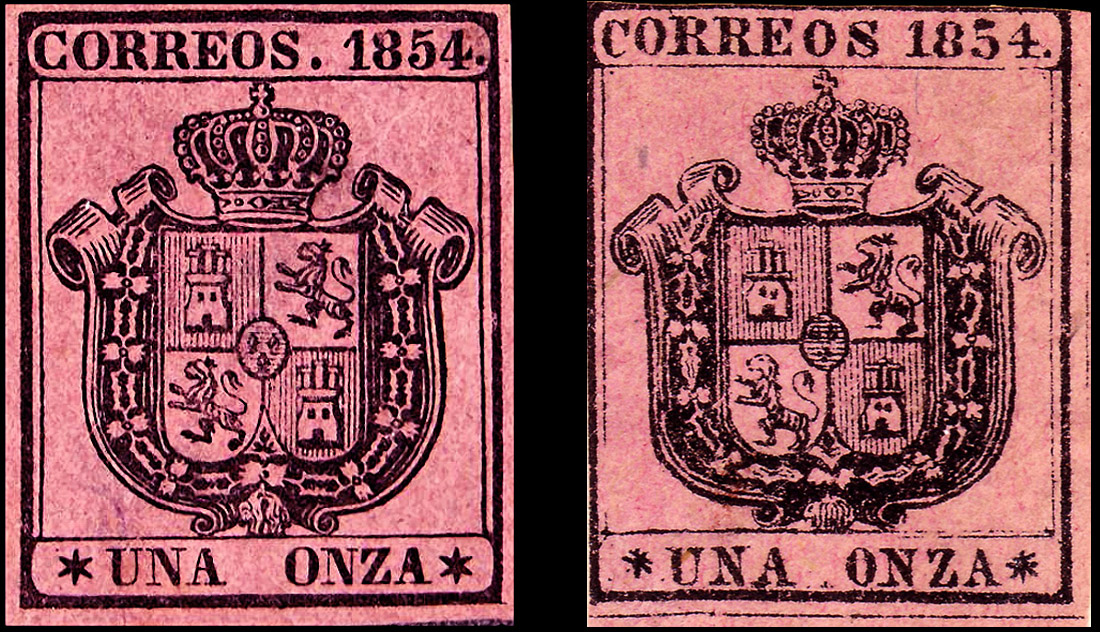
Genuine Features
1. Note shape of jewels in the crown band
2. The ends of the vertical and horizontal lines do not touch the outside frame
3. 2 distinct lines in the scroll
4. Several of these sections have dots in them
5. Break in the chain
6. Dent in the chain
7. Broken line
8. Right leg slants inwards slightly
9. Break in frame
10. Left end of the frame dips downwards
11. Large white space in the castle section
12. Break in frame
13. Color blotch here
14. Break in scroll
15. Vertical lines do not touch the upper frame
16. Element has a break
Forgeries
2 Cs
Facsimile forgery
Printed by lithography in black on yellowed cardboard paper.
Original purpose unknown
1. Top inscription has distorted letters. The E is slanted
2. The cross lacks the top section.
3. The separation gap of the scrolls is Vshaped.
4. The corner ornaments lack the central arm.
5. The point after the number 2 is missing.
Fournier forgery
Printed by lithography on medium paper
1. The curve of the right oval in the left set is formed by a dash line.
2. The small S is slanted
3. Letter O of FRANCO is higher
4. Large space between the FR and AN of FRANCO'
 |
| Fournier full sheet |
Segui Forgery
Printed by typography on white or yellowish paper, medium or thin.
1. Second O of CORREOS is smaller than the other letters
2. The lower right pearl of the crown is open.
3. The crown of the upper lion is almost nonexistent.
4. The top left scroll is not broken
5. The right leg of the N is tilted
6. The central horizontal bar touches the frame
7. The white dots in the chain links are missing
4 Cs
Fournier Type I forgery
1. The curve of the top left scroll is made of dots
2. The letter C of FRANCO is thin on the bottom
3. The 4 has a curve in the horizontal line
4. The oblique lines in the large top scrolls are very heavy
 |
| Fournier full sheet |
Segui Type II forgery
Printed by typography on medium or thin white paper. A very good forgery
1. The four pearls of the corner ornaments are small.
2. Broken left scroll of the left set, as in originals which differentiates it from the Segui Type I
3. The 5 has a small head
4. There is no point in the third ring on the right.
5. The bottom line has no breakage.
6. The pearls in the crown are indistinct
Type I forgery
Printed by lithography on white or bluish paper.
1. The figure 1 lacks the top serif
2. The tip of the upper left ornament is very wide.
3. The top right ornament touches the top line.
4. The right scroll is incomplete.
5. The lower ornaments rest on the frame line.
6. Lacks the point after the number 4.
7. Lower letters are uneven
Type III forgery
Printed by lithography on medium gray paper. Very bad design.
1. Lacks the point after CORREOS.
2. The base of the crown is very narrow
3. The lower lion looks lacks a crown.
4. The left base of the shield does not rest on the frame line.
5 .The upper left and lower right trim touches the frame lines.
Type V forgery
1. The first R of CORREOS is large and the S is shaped oddly
2. The 1 is inclined as is the base of the 5
3. Large cross
4. Large heads on the lions
5. The lower thin frame line is straight with no breaks
Type XV forgery
1. The OR of CORREOS is large and the O is low
2. The 5 is oddly shaped
3. Large heads on the lions
4. The cross has a tall top
Torres Forgery
Overall a good forgery
1. The second R of CORREOS is wide and the right side of the O is thick
2. The vertical shading lines in the shield are indistinct
3. The bottom left corner element is different
Unlisted forgery I
1. The OR of CORREOS are close
2. The S is low
3. The 5 is short
4. The O of FRANCO is low
5. Lions have large heads
6. The cross is large
Unlisted forgery II in white or blue paper
1. The 4 of 1854 is inclined to the right.
2. C of CORREOS is more closed and the O is inclined.
3. The 1 has a thick base
4. The Cs is badly shaped
5. The lower thin frame line is straight with no breaks
Unlisted forgery III
1. Odd shaped S in CORREOS and the O is inclined
2. The letters are generally thinner
3. The top left scroll has a large break
4. The RR of CORREOS are shorter than the other letters
5 The 1 of 1854 is inclined
1 Lr
Fournier forgery
Printed by typography on medium paper.
1 The curve of the right oval in the left set is formed by a dotted line.
2 The links in the chain lack pointed spikes.
3 The background stripes of the castles’ cartridges are thick and irregular lines.
4 Lower inscription has slightly misaligned letters.
 |
| Fournier full sheet |
The Fournier album also contains these forgeries.
I have no information on their purpose - perhaps sold as "color trials" ?
Segui Forgery Type I
Printed by typography on medium or thin white paper.
1. Broken top right of scroll left of the crown , as in genuine stamps. (Key difference with Segui Type II)
2. Numeral 5 head is short and thick. The bottom opening is wider.
3. There is no point in the third chain link on the right.
4. The bottom line has no breakage
Segui Forgery Type II
1. Numeral 5 has a large bottom opening
2. Top left scroll has no broken line
3. No breaks in the bottom thin line
4. The cupula of the upper right ornament is not broken
5. The NC of FRANCO is not taller than the other letters
Graus Type I forgery
Printed by lithography on white or bluish paper.
1. The numeral 1 has a short serif.
2. The 8 is slanted and the 5 has a thick top
3. The right scroll is incomplete.
4. The right lion looks like a dog
5. The last R is wide
6. The base of the crown is very narrow
Graus Type III forgery
Printed by typography on thin white paper.
1. letters C and O of CORREOS are larger than the other letters
2. The figure 4 touches the dot.
3. Bottom letters are thin
4. The white spaces in the chain links are too wide
5. The left hand of the lower lion almost touches the frame.
6. Small letter L is short.
References
Introduccion al estudio y relacion de los sellos falsos postales de Espana – Francisco Graus
Michel Europe West 2012
Spain & Dependencies – Edifil.2009
Focus on Forgeries – Varro Tyler
Spain Specialized Vol.1 1850-1931 Edifil Tome 1
Catalogo dos Sellos De Espana – Antonio Duro
Seranne Guide to Forgeries
Torres Catalog 1879
Las falsificaciones del Sello Espanol – A. Monne 1965
SPAIN FORGERIES 1850 to 1925 by De Haene
FFE #7 Forgeries of SPAIN
Timbrex – H. Schloss
Forged Stamps of all Countries – Dorn
HANDBUCH DER BRIEFMARKENKUNDE HEFT 6: CARLISTISCHE POST – H. NEUES
Album Weeds – Earree
Tedesco Forgery Index
Handbok Fer Filatelister – S. Tullberg
Guia del coleccionista de sellos de Correos de España, 1850-54 – Tort
Members of Spanish forums
Forgeries of Europe - Bynof


 NOTE the crude head features as many of the following forgeries have the same features.


 There is no question of this being a forgery or reproduction.


 These forgeries are basically identical to the Fournier issues.
 Another set with a facsimile overprint.