Tuesday, February 23, 2021

Belgium 1914 Merode

After the German invasion there was a need to produce stamps with a surcharge for the Red Cross, for which the designs of MacDonald, which were already at an advanced stage, were adapted and printed at Verschueren.
MacDonald had worked as a representative of the Maroni-Paris company that manufactured copper intaglio presses.

Generalities
Printed in lithography: J. Verschueren in Antwerp 
Publication day : Saturday 3/10/1914
Perforation: 14, other perfs can be found, 12X14, 12, 14X12 (very rare). Imperfs also exist.
Sheet: 75 stamps in three panels of 25
End of use: 14/08/1920
Postage: only valid in the domestic traffic
Remnants: these were "apparently" burned at the stamp printing company in 1928

The numbers printed are up for debate.
The initial plan called for:
5c: 600.000
10c: 600.000
20c: 75.000
Catalogs and the Red Cross indicate much lower actual numbers.

Sheet edges will sometimes show a hand applied rectangular "Depot 1914" in the frame. This stamp was applied as proof that the printed sheet had been approved and deposited. The stamp appears in different locations
Above image from an auction catalog.
There is no mention if this certification appear in forgeries

The Genuine Stamps
General Features
1. The letters B and E of BELGIUM do not touch.
2. The oblique line on the foot of the L of BELGIUM is short.
3. The cedilla of the Q of BELGIUM is drawn very visibly; The shape of the cedilla is different for each of the three values.
4. The lines are drawn clearly and evenly and have no interruptions or imperfections.
5. The shape of the front and rear scrolls of BELGIUM is different for the three values.
6. The crosses have rectangular corners and the pale red color covers the entire surface completely, without blemishes or interruptions. The 10c cross is printed in the same color as the rest of the stamp.
The four lines above the compartment with the word BELGIË consist of small squares, which are always visible, even with very heavy printed stamps. Counterfeit stamps have solid lines.
NOTE - the crosses show a pattern of darker ink squeeze on the edges from the die pressure.

5c Genuine Features
1. BELGIQUE is in the middle of the section.
2. The letters B & E are well separated
3. The leaf above the first E of BELGIQUE is not attached to the letter.
4. The letters E & L and U & E of BELGIQUE are attached top & bottom.
5. The first E of BELGIQUE is closed at the bottom.
6. The top of the E is joined to the small curl right of it
7. The curl is attached to the scroll below it
8. The letters of BELGIË are touching each-other at the foot.
9. The squares are partially visible - not in the forgery
10. Note the shape of the tail, it is different in each value
11. The upright of the 5 can be broken as with the foot. The top bar is not flat but has a dip at the tip.

Genuine Flaws

10c Genuine Features
1. The leaf almost touches the first E of BELGIQUE.
2. BELGIQUE is closer to the top of the section.
3. Note the shape of the tail, it is different in each value
4. The leaves above the letter Q of BELGIQUE almost form a straight line.
5. Two lines or two rows with dots in the 0 of the 10 at the right - difficult to see
6. The EL, GI and UE are attached top & bottom.
7. Second E of BELGIQUE is open.
8. The letters of BELGIË are touching each-other at the foot.
9. White vertical line under the second E of BELGIË
10. The cross is the same color as the stamp - note the dark edges (ink squeeze)
11. The squares are partially visible - not in the forgery

20c Genuine Features
1. There is a dot in the right side of the 0.
2. The second E of BELGIQUE is open.
3. Two lines or two rows with dots in the 0 of the 10 at the right
4. The left 20 has little notch in the scroll of on the left of the foot.
5. Note the shape of the tail, it is different in each value
6. Only the letters UE of BELGIQUE are touching each other.
7. The line in the scroll at the right of the E of BELGIQUE is broken in three pieces.
8. Unlike the others the shading lines are more visible.
9. The cross is a dull red - note the dark edges (ink squeeze)
10. Shaded lines above and left of BELGIË not clearly printed.
11. BELGIQUE is closer to the top line of the sector.

Genuine Flaws

The genuine cedillas - inking variations will occur

Forgeries
The basic premise for forgeries is a lack of a definite tail in the Q of BELGIQUE and rather a letter that looks like an O.
Although this applies to most forgeries, more recent studies clearly point out
THIS IS NOT THE CASE!

From March 1915 to October 1916, the printer Verschueren manufactured enormous quantities of counterfeit stampsnot made with the original stones.
After the start of the bombardment of Antwerp on October 7, 1914, the printing machines were shut down, the stones were defaced and the paper destroyed.
However, some original imprints and some that were rejected (closed Q) were left in the printing house and Verschueren made new stones.
This resulted in 2 forgeries
The forgeries with closed Q in BELGIQUE made from rejected imprints. These account for the majority of forgeries.
The forgeries with open Q with proper overprints without deviations were produced, as with the original printing.
The forgeries are generally noted as the "Easy" and "Dangerous" forgeries.

5c "Easy" Forgery
In the forgery (right)
1. The left 5 vertical is not thinned or broken, the foot is not thin
2. BELGIQUE is closer to the top
3. The vertical extension on the L right foot is too long
4. The 2nd E is not attached to the curl
5. Some letters in BELGIE are not attached
6. The O only has a vestige tail and the crosses are bright red - the 2 main features

5c "Dangerous Forgery"
Unfortunately I do not have a sample
The features are:
1. Vertical line of left 5 has break at top (not always)
base of 5
.
2. Small varying imperfections in left foliage.
3. Shorter or broken line in the volute above right.
4. Small curved line almost disappears in circle at the top right .
5. Poor definition respecially between the legs of the central figure
6. The top frame line has many broken spots
7. The tail in the Q is different and shorter - Key feature
8. The cross are bright red and lack the edge ink squeeze.

10c "Easy Forgery"
In the forgery (right)
1. BELGIQUE is in the middle of the compartment.
2. The leaves above the QUE do not form a straight line
3. The second E of BELGIQUE is closed
4. The 10's show no signs of dots or dashes
5. Several letters in BELGIE are not joined
6. The vertical line below the E of BELGIE is removed
7. Other features are the same as the 5c
8. The O only has a vestige tail.

10c "Dangerous Forgery"
1. The noticeable difference is the color. The stamp is Vermilion and not a rose red - Key feature
2. There is no dot in the right 0
3. There are many breaks in the top frame line - Key feature
4. The leaf above the BE is missing some details
5. The tail in the Q is different and shorter - Key feature
6. The cross lacks the edge ink squeeze.

20c "Easy Forgery"
In the forgery (right)
1. The 2's are thicker
2. The left 2 does not sink into a notch in the frame
3. The curls to the sides of the 2's are much larger
4. The second E of BELGIQUE is closed.
5.  Several letters in BELGIE are not joined
6. The oblique line at the foot of the letter L from BELGIQUE is too long.
7. The O only has a vestige tail and the crosses are bright red - the 2 main features

20c "Dangerous Forgery"
1. As with the 10c the upper frame line has many breaks
2. The ribs in the left leaf are lacking and indistinct
3. There are a lot of white spots around BELGIE
4. The tail of the Q is very short
5. The overall color is violet and not lilac
6. The crosses are bright red with no ink squeeze

It has been noted that a 3rd forgery exists with tjhe Q tail added on later.
It is apparently only known canceled with 
ANTWERPEN-ANVERS 6M 2 X 12-13 

Imperforate Forgeries
These are not common but do show up on auction sites.
The ones I have seen tend to have very bright red crosses.


Reprint
In 1929 a reprint of the 50c de Mérode stamp was made on a miniature sheet, based on the original mother plate still existing at that time.
The reason for this could have been a question from postal museums in other countries, which prints of Belgian stamps asked to supplement their collection.
It is seldom available.
Above a proof of the 50c

Sunday, February 21, 2021

Russia 1922 Charity

This issue of Charity stamps was a 'first' in Russian Philately as
it was a compulsory tax levied locally by the Narcomfin Executive in Rostov on Don for the benefit of those suffering under the famine.

The stamps included the word ”pochta” or ”post” in their design and had to be added to all registered letters, parcels, and money orders in addition to the regular postage. 

Receipts from the sale of these stamps went into the Fund for the Hungry . Therefore, this was one of the forms of local tax initiated by the Commissioner of the South East Region of the RSFSR and put into operation by the post office. 

It was obligated to sell these stamps to collect, in addition to the regular postage, 2000 rubles for registered letters, 4000 rubles for money orders, and 6000 rubles for parcels. Actually, these stamps should be considered as revenues or postal tax stamps.

They were lithographed from designs of philatelist A.L. Manerick and printed in two colors (red and green) in sheets of 133 stamps. The left two- thirds of the sheet was printed in green and had Scott numbers B30 and B33, while the right one-third of the sheet was printed in red and had Scott numbers B31 and B32.

They were printed on white unwatermarked paper and issued imperforate. The total printing was 740 sheets

These stamps were issued on April 19, 1922 and sold in Rostov on Don, Novocherkask, Millerov, Nakhichevan, and other cities of the South East region. 

B30 Genuine
size 57.5 X 47 mm.
1 & 1a, The left “P” is different than the right one and the same height as the other letters.
2. All the letter have a dot after them
3. Note the shape & direction of lines of hair strands
4. Note the shape of the collar
5. Note the lines on the arm and the sleeve
6. Note the shape of the boot and the rock on the ground
7. Circles are generally complete (I have seen some partial)
8. The top of the “A” is broken
9. The sickle is in front of the hammer and note the shape of the handle
10. The left “2” is wider and larger than the right one
11. Note the size of the top bar on the “T” and the dot afterwards
12. The stem on the right is larger than the one on the left


It is not uncommon to find these stamps as double and even triple error prints

Genuine with flaws; broken sickle & K


Genuine copy on very dark paper
 

B30 Forgeries
This forgery appears to have the most variations.
There is confusing and contradictory information on the types and numbers with authors mention only 2 and up to 4 "types".
I found it difficult to match them up so I am presenting some finds in no particular order.
The genuine is on the left.

This is probably the most accurate one and common forgery.
The main differences are:
The sickle is in the back of the hammer on the forgery
The boots of the right peasant are very different


In this forgery;
The circles on the sides of the hammer/sickle are open
The first P of each top word are shorter than the other letters
The A letter in the center is not dented
The hammer/sickle is different - note the handle

In this forgery;
The hair of the left peasant is different
The left 2t is missing the dot
The W shaped letter in the central word is lacking the downwards serif

In this forgery;
The paper is yellowish
The top P's are shorter
The left 2t has a short right bar

In this forgery;
The letters are thicker
The handle of the hammer is heavily shaded
The A is not dented
The shading and wrinkle in the right peasants sleeve is different
This might be a more modern forgery

Now the puzzle
In this forgery block on yellowish paper I call the Black Eyed Peasant we have many differences aside from the black and tiny eyebrow less eyes.
Note on the left top and bottom stamps, the sickle handles are different as are the boots on the right peasant.
All the stamps show varying degrees of shading on the right peasant.

B31 Genuine
1. Corner is complete
2. Arcs are visibly separated from the dome on both sides
3. The hand clearly shows 4 fingers
4. The fold is made up of two pleats that join at the bottom
5. The folds are distinct lines
6. The dot is visible but weak
7. These 2 dots appear in the blocks I have but I do not know if they are constant

B31 Forgeries
There is some confusion here also about the types.
Generally 2 forgery types are proposed and I found one to be abundant while the other was scarce.
B31 TI Forgery
1. The corner is broken
2. The folds comprise of one thick line
3. The folds are just a blob of color
4. The T and dot are prominent. All the bottom letters are thick.
5. There is an oblique appendage below the left leg of the A

B30 TII Forgery
1. The corner is complete but they tend to all have a bevelled edge rather than a sharp corner 
2. The curved line touches the dome
3. No fingers showing but there is a thin line across the palm
4. The lines are very distinct
5. The dot is almost invisible

B32 Genuine
1. The T's do not touch the circle frame line
2. The dots are evenly spaced
3. The sleeve clearly shows the lines

A genuine triple print

B32 Forgery
In the forgery;
The T touches the circle frame
The lines in the sleeve are a single shading
The hand and wrist has uneven dots
The cancel is probably a fake to greatly increase the value


A very crude overinked forgery


Miniature copies of Nos. 830-833 exist, taken from the 1933 Soviet catalogue.


B33 Forgeries
B33 Type I Forgery
This is the common forgery
1. Dots are missing
2. Hair is different and shaded
3. The bag has a protrusion or an added pleat
4. Large white area
5. A constant break here

Another type I with some top letter variations


B33 Type II Forgery
Some authors mention an uncommon very well executed forgery with the following features.
The first 2 letters CP are shorter than the others
There are some breaks in the outer frame
The basket weaving is defined and uniform


A genuine double print


Original Blocks
Multiples tend to be more often genuine


Genuine stamps on a cover
Cancels appear genuine but no guarantee


An unrelated agricultural label

Wednesday, February 17, 2021

German States Sperati

NOTE - All images show the genuine on the left & Sperati on the right (unless multiples of Sperati) - click on images for the full picture

Baden
A desire was expressed for stamps of a higher value than 9kr, the first step being taken by the Chamber of Commerce of Mannheim, who proposed to the Baden Ministry of Commerce that 18kr and 30kr stamps should be created.
Although the use of the then current 12kr and 18kr envelopes had been very restricted the Ministry decided to introduce 18kr and 30kr labels and Kurz was commissioned to supply the necessary dies for these values. The dies, which were in the design with plain background, were delivered on October, 28th, 1861, and Hasper (the University printer) at once proceeded to make the cliches for the printing plates.
The colors decided on were green for the 18kr and cinnabar-red for the 30kr. The 30Kr was changed to orange as the pigments reacted with the copper plate. The cinnabar-red ones are rare.

1850 Issue 1kr - Type A
1. there is a white spot just to the right of the E on BADEN
2. there is a white spot before the 1 of 18

1850 Issue 1kr - Type C
1. There are white spots on each side of the "I" of "VEREIN"
KREUZER"
2. There is a white spot with weakness in the background
between the first R E of FREIMARKE. 
3. There is a white spot on each side of the S of POST
4. There are white spots each side of the I of RElN
5. There is a weak spot rather like a stop after the final
R of KREUZER

Bayern (Bavaria)

1850 1 Kr Type A
1. There is a white dot between the Y and bottom leg of the E of BAYERN
2. There is a nick at the outside edge of the black field of EIN label at top left

1850 1 Kr Type B
1. There is a thin white line that nearly joins the E upright and the bottom horizontal leg of BAYERN
2. The lower curve of the C of FRANCO is malformed

1850 1 Kr Type C
1. There is a white flaw that touches the top left of the B of BAYERN and the frame
2. There is a white flaw connects the letters UZ of KREUZER

Tete-Beche Type C
All multiples are presumably Type C's

Type C with fake cancel


Bergedorf

1861 ½s
Sperati made a copy of a proof shown left
1, There are color dots above the H and B of HALBER
There is a large dot outside the top right frame opposite the 1/2

Bremen

1855 3g
The Sperati forgery is noted as having 2 features
1.There is a constant dot between the crown and shield
2. There is a large dot/mark between the frame opposite the right 3
However, the right mark also appears on some genuine stamps like the left certified stamp (Sperati would generally model originals)
Below is a block of Sperati forgeries and neither marks appear on all of them.
The Sperati forgeries certainly have more line breaks especially in the shield.
If one looks at the key handle the left knob has a partial ring in all the forgeries.

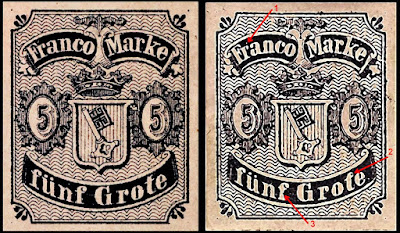
1856 5g
This is a reproduction of the original proof as seen on the left stamp
1. There is a small white spot over the r of Franco
2. The right serif of the t of Grote forms a loop at the top
3. The f in funf has a dent on the right side but I do not know if this is constant.

1856 7g
1. The background lines are weak
2. There is a large color mark right of the a of Franco
3. There is a dot in the k
4. There is a dot above the G
5. The right side of the t is completely missing
6. The n has a dash above left
Some of the above may only be a specific plate flaw

1861 Issue 5g - Types B-C / D-E
Type B
1. there are small breaks in the vertical shading lines above gr. and V at right
2. there is a dot of color to the left of the 5
Type C
1. there is a break in the outside line of the link at bottom left
2. three vertical lines under the R of BREMEN have been strengthened
Type D
The top pearl on the right is masked by a large blob of color that covers the white space to the left
Type E
The top pearl on the right has a central blob instead of a round spot

Brunswick

1852 Issue 2sg
1. The vertical shading lines have numerous breaks
2. The inner frameline at top has breaks at left edge
3. The cross is shaped differently

1852 Issue 3sg
1. The outer frameline has one breaks and one dent at lower right
2. The outer frameline has a dent at top left near corner
3. There is a dash bottom left of the G - constant flaw?

The cancels used by Sperati are:
'BRAUNSCHWEIG 12/2' in a halfcircle
'BRAUNSCHWEIG 15/5' in a halfcircle
'BRAUNSCHWEIG 23/7' in a halfcircle
'BRAUNSCHWEIG 5/11' in a halfcircle
'WOLFENBUTTEL 16/3' in a halfcircle
'WOLFENBUTTEL 6/7 11 1/2 - 12' in a double circle

Hannover

1860 Issue ½gr
1. There is a break in right frameline just below the R of HANOVER
2. There is a white flaw in the head of the G in Grochen

1861 Issue 10gr Type A
1. There us a dot of color outside the corner ornament at top right
2. the vertical two line above the right side of the loop of the R in HANOVER are crooked

1861 Issue 10gr Type B
1. The lower serif of the G of GROSCHEN has a curved point
2. The top right corner element appears damaged

1863 Issue 3pf Type A
1. The foot of the E is joined to the H of ZEHNTEL
2. The L and the B of SILBER are joined at the foot

Lubeck

1859 Issue 2s
This stamp has an error in the name - ZWEI EIN HALB
1. The top of the "2" in upper left corner has a flat top
2. There is a projection into left margin at top left corner
3. In the neck of the right eagle there is an oval shaped void area with a colored dot (below)

Mecklenburg-Schwerin
When postage stamps were introduced in Mecklenburg-Schwerin on July I, 1856, there were 68 post offices. 
In addition to that there were eight post offices in railroad stations where post offices in the towns proper functioned; they were considered branch post offices.
There were traveling post offices on the main line from Hagenow to Rostock and on several supplementary lines.
The postal service was supervised by the Ministry of Finances and directed by a General Postal Directorate
In 1856, the number of pieces of mail was about 2.75 millions, therefore about 40,000 per post office and 4.5 per head of population.
Mecklenburg-Schwerin had several post offices on foreign. soil, namely at Hamburg, where the post office was opened in 1674 and closed on December 3l, 1867, with the only interruption during the French occupation, 1809 to 1814.
These postmarks are sought after.

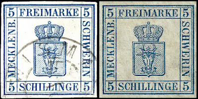
1856 Issue 5s - Type A
1. The outer frameline above the E of MARKE is weak
2. The letters K and L of MECKLENB are joined at top

1856 Issue 5s - Type B
1. There is a downward bend in thin frameline above the M of MARKE
2. There is a small break in the frame line below the M of MARKE
3. The frame lines are not quite in liner with each other
4. The 5 has a very thin spot or break in the upper right side curve of the body

Oldenburg
Except for the last issue, all the stamps are lithographed. In lithography, where every stamp is individually engraved by hand, it rarely occurs that one specimen exactly resembles another.
The paper of the stamps of Oldenburg must always be examined meticulously, for many copies with supposedly thin spots are not actually thin. The paper is cloudy, that is, light spots show within the structure of the paper. 
There are splinters of wood, sometimes large in the paper. They are dyed in according to the basic color of the paper. 
Differences in size of the several issues depend on, how much the paper was dampened, and how much it contracted again after printing.
Copies with original gum of ·the first issue are usually re-gummed. There were no stocks of leftovers, and so unused copies with original gum are very rare.

1855 Issue ⅓sg - Sperati Type B
1. the B of OLDENBURG is cracked where the two loops join
2. there is no extra black dot below the serif and attached to the G

1859 Issue ⅓sg
1. There is a dot midway back of the B
2. Dark spot between frames
3. The 1's tend to be wider than the originals
4. Frame line is broken
5. The line extends past the frame but is bolder and longer than the original

1859 Issue 2g
1. There is a break in top frameline above the L of OLDENBURG
2. The frame lines do not meet correctly at top left corner as top line is too short

1859 Issue 3g
1. There is a white flaw in the crosshatching above the D of OLDENBURG
2. There is a spur in between the left frame lines just below the level of the large C shaped ornament

1861 Issue 1/4g
1. There is a large flaw below the o of Groschen
2. There is a break in the left frameline just below the top junction
This issue is VERY expensive used, so many fakes exist. Almost all the genuine were cancelled with a BLUE cancel so any black ones are very suspicious.

1861 Issue ⅓g
1. The fraction at the right appears to be 1/8 instead of 1/3
2. There is a colored protrusion on lower edge of the crown at the right side

1861 Issue 1/2g - Type A
1. There is a colored spot above the al of Halber inside the curved frame lines
2. The bottom of the top B of OLDENBURG is broken

1861 Issue 1/2g - Type B
1. There is a large flaw to bottom left of the E of OLDENBURG
2. There is a nick in the right outer frameline mid way up on the right

1861 Issue 1g
1. There is a dot inside the outer left frameline opposite the lower scroll
2. There is a small break in outer frameline at right opposite the lower scroll

1861 Issue 2g - Type A
1. There is a large break in left frameline opposite the ribbon above left numeral 2
2. There is a horizontal colored scratch on right side frameline just above the right numeral 2

1861 Issue 2g - Type B
1. There is a defect inside the left frameline in the top left corner
2. There are scratches below the top line of the G in Groschen

1861 Issue 2g - Type C
1. There is a large colored spot at top left corner joint
2. There are marks between the background and the outer frameline in the lower left corner

1861 Issue 3g - Type B
The originals I have are too worn to show details - a particular issue with this stamp especially given the weak yellow colour
1. There is protrusion on top frameline at left corner
2. The background firmly touches the bottom frameline at left and below the sch of Groschen

Saxony
Of all the early European stamps, the Saxony 3pf is one of the most desirable.
The 3 Pf. red originally was in tended for use only as a provisional.
New stamps were in preparation, but it took more than a year before the 3 Pf. green replaced it.
The design was not elaborate as a result, and it was an imitation of the first Bavarian stamps.
It went from a woodblock to a lead filled plaster cast. As a result there are many plate faults, differences in sized and print quality as the die was worn with use.
Due to the way it was used by the public, very few used ones remain.
The post order stated that the stamp should be affixed to the upper right hand corner of the wrapper. Instead of doing this, however, the public placed it partly on the wrapper and partly on the subject matter to act as a seal. Most were torn when the wrapper was opened.

1850 Issue 3pf - Sperati Type A 
1. There is a white dot in the outer frame over the S of SACHSEN
2. The shading of the numeral 3 is very blurred and nearly solid, particularly in the lower portions

1851 Issue 3pf
12.25 million originals were printed in 24 editions so there are a lot of color variations.
These color variations make them difficult to distinguish.
The Mi 2I has a much higher CV.
Generally it is sharper in detail and more dense in color.

Below Mi2I & Mi2II

Sperati - Type A
1. the top frameline is broken in places and generally weak at left as well
2. the top serifs of the H in SACHEN are joined

1851 Issue 3pf - Sperati Type B
1. The outer frameline is strong at top left and top, but almost disappears at lower left
2. There is no horizontal stroke on the A in SACHEN

1856 Issue 10ng - Sperati Type A
1. The top outer frameline does not join at the upper left
2. The left 0 in 10 appears to be doubled and smeared

1856 Issue 10ng - Sperati Type B
1. There is a break in the right upright of the letter "N" in "Neu"
2. As  with the type A, the left 0 in 10 appears to be doubled and smeared

Thurn and Taxis

1852 Issue 18kr
1. There are colored spots in the backgrounds above the i in the top panel and in the ornament at bottom right
2. The top right small fraction looks like 8 instead of a 3

Wurtemburg

1852 Issue 18kr
1. In the upper loop of the 8 the second horizontal line from bottom is broken
2. In the lower loop of the 8 the second horizontal line from bottom is broken

1875 Issue 2m
1. There is a thin white line around the front point of the 2
2. There is one or more tiny white spots in the P of POST