Sunday, October 31, 2021

Bulgaria Airmail 1927-32

 1927 C1-C3
The first airmail stamps of Bulgaria were issued in 1927 by overprinting existing ones.
As this was the height of the stamp packet trade, fakes soon appeared.

Original issues


Care needs to be exercised as this issue was followed by another one where the overprint colors were changed.
The stamps were not issued and the CV is much lower.

Unissued stamps

Fakes
The fakes are easily identified by the poor impression of the plane
The letters are illegible and the plane is tilted downwards


1932 C12-C14
These stamps as genuine are not common and the CV is relatively high

Genuine stamps

The forgeries are plentiful and were lithographed as opposed to the typographed originals.
The printing  details are rather poor
They appeared in Italy and were widely distributed after WWII.

Several areas of concern are outlined on the right stamp

New Additions will be added at a later date

Tuesday, October 26, 2021

Poland 1924

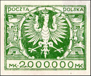
Ten hyperinflation denomination Polish stamps, based on the 1921 definitive postage stamps designs, were issued in 1924.  These stamps were printed on thin paper, and their perforation gauges range from 10 to 14 1/2, including examples with compound perforations.
Their valid period was short lived and they appear to be fairly common. Possibly due to foreign demand a variety of forgeries appeared of the 2 highest denominations.
The forgeries vary significantly in design, perforations, imperfs, colors and papers including tete-beche and bogus stamps

Original 1924 set


The originals can be found as imperfs
The red stripe is common on Polish auctions and is probably some form of invalidation.


Genuine block
The numbers in the selvage were probably for PO clerks in assisting the total value to that point in the sheet


Forgeries
The forgeries 0f the 2mil. stamp are numerous, the 1mil appear to be scarce


This forgery is very crudely drawn
Note the middle side decorations that are lacking any resemblance to the original
The top KA are joined
Both top A's extend the right leg to the frame
The bottom right MK is thick and the dot is a dash


The head and tail bear no resemblance to the original
The right top P touches the frame
Details are lacking on the griffin

The same design as the above
The right one has thicker lines and the eye is different


This forgery is the obvious mate to the 1Mil above with the same crude features and missing details
A heavily ribbed paper was used.


This forgery is well done and dangerous
The head is different and lacks the opening around the eye
The feet and claws are thicker


Bogus color
Very crude and poorly printed


Another bogus color sold as a tete-beche
Crude design
Many issues with the letters


By far the crudest design and bogus color
The head looks like a pigeon
Ornaments are only partial
Letters and numerals are uneven

Monday, October 18, 2021

Cuba - 1855-57 1R & 2R

 The Original Die used to print this 1 Real value was engraved in 1854 by Don Jose Perez Varela at the Fabrica Nacional de Sellos in Madrid, Spain.
A few features were added so it could be differentiated from any possible forgeries that were numerous for Spanish issues. 
The cost and difficulties in obtaining large amounts of hand-made papers prompted the Spanish Postal authorities to use an unwatermarked machine-made paper which prompted the flood of forgeries.

The 1R has a variety of colors and quality depending on the state of the dies at the time of printing.
Deep green, yellow green & worn die lemon color

Worn 1856 die & acid cleaned 1860 die
NOTE - In the genuine, the circle is not centered but slightly to the right and there should be 73 evenly spaced pearls in the circle


Forgeries

Forgery Type I
- Top letters are thinner and the second "0" is inclined. 
- The right inferior rossete is flat at the base. 
- Number 1 is thinner than the original. 
- The bell shape ornaments are smaller
- The line of the hair touches the eye and the eyebrow.
- This counterfeit appeared during the years 1859-63


Forgery Type II
- The height of the counterfeit stamp is slightly shorter than the genuine.
- Flaw under "P" of PLATA.
- Letters are more irregular, specially the second “A" of PLATA.
- The 1 is thicker and more imperfect than the original. 
- The line of the hair is almost a straight line in the forehead and thicker between the eye and the ear.
- This counterfeit appeared during the period 1862-1863.

Postal use of Type II
Havana to Santander, Spain.
Havana, September 30, 1862.

Type II Block


Forgery Type III
- The face of the Queen is very different 
- The top C & S are inclined
- The background pearls are smaller and uneven
- The bell shape ornaments are not uniform and very different from the originals
- They were counterfeited in Havana and they are known as "COUNTERFEITS OF HAVANA". 
- The counterfeiters were apprehended and most of the stamps siezed by the Spanish Authorities.
Type III Block


Forgery Type IV 
- A rather crude forgery
- The queen lacks the laurel leaves in the hair
- The eye is much smaller
- The bell shape ornaments are much smaller
- The top letters are shorter


Forgery Type V - Image from period book
- Overall very crude
- Under the eye there are vertical shade lines
- The circle pearls vary greatly in size
- Background pearls are scattered with many joined

2R

First, second & third printings


Forgery
I have only found 1 postal forgery

- Thick uneven letters
- Coarse shading
- Pointed nose
- Small uneven background pearls

Sunday, October 17, 2021

Hawaii 1853 5c & 13c

 Hawaii's second issue featuring King Kamehameha III was produced by intaglio printing in Boston, thus the name "Boston Engraved." 
They are assigned Hawaii Nos. 5-9 in Scott Catalogue. 
Only two denominations were printed, 5c and 13c and issued in 1853
The 5c value paid the Hawaiian domestic foreign mail charge to handle a letter and deliver it to a ship bound for San Francisco. 
The 13c value paid both the Hawaiian 5c rate and the United States 6c rate from San Francisco to the Eastern States plus a 2c ship value.


Given their high value, few collectors will ever own the originals.
But they make an interesting subject given the abundant forgeries.
The main problem for collectors are the relatively affordable reprints passed off as "originals"

Trial color proof on thick wove paper

Given the need for five cents a new supply was made from the same plates used for the 1853 printing on a thin chalky white paper in 1857. 
These stamps are designated Scott 8. 
In 1860, a new five cents printing was ordered made from the same plate. 
These stamps were printed on a thin bluish paper and are designated Scott 9.
Both issues are on paper so thin the reverse clearly shows the design
They both have the same features as the 1853 stamp.

Genuine features

5C
- There is a tiny dot opposite the left 5 near the frame line
- There are 2 dots below the image in the value tablet
13c
- The vertical frame lines all extend to the edges - not in some forgeries
- The numeral 3 has a protrusion on the right side, it varies in size and clarity depending on the plate position and can be used to determine the position.
- The right side outer frame line is doubled.


genuine 1857 type I applied by clerk Alvah Clark

Rare type II applied by postmaster Jackson


1857 re-issue Sc 7 on thin white paper


Re-issue Sc 11


Forgeries

Spiro forgery
- Immediately identified by the dot in a white space on the chin
- Typical 4 ring cancel
- No double right frame line


Torres forgery
- These are very close to the Spiro but without the chin dot
- The 5c has a typical Torres cancel
- Obviously some relationship with Spiro


Moens forgery
- Facial features are crude
- The eye on the right is higher than the one on the left


Forgery attributed to W. Scott
- Thick letters and odd eyes


Unknown forger
Decent forgery
- Lacks the original features
- Eyes are very different


Unknown forger
- Thick tall letters


Forger unknown
- Very crude
- Wide nose and odd eyes


Forger unknown
- Very good forgery
- Lacks genuine features
- 5's are narrower
- Odd blemish above the eye on the right


Forger unknown
- Overall pale shading
- Letters are smaller, narrow H
- Double outer frame


Forger not determined
- Speculation it is a period privateer "Bully Hayes" and it is so named
- Very crude with tall thin letters
- Large 5's


Forger unknown
- Considered "dangerous" but I differ
- It has features similar to the original but the facial ones are different and the shading is very different
- Many horizontal lines in the tunic are broken and the buttons are larger


Extremely primitive


Unknown forger
- Lacks all the features of the original
- Letters are short
- The 3's do not line up with the 1's
- Eyes are very different


Forger unknown
- Lacks all the genuine features
- Face is heavily shaded
- Cancel is similar to one found on Spiro forgeries


poor forgery -unknown forger
- Letters & numbers uneven
- Face very different
- C of Cts looks like a 6


Very crude design -forger unknown
- Facial feature distorted
- Heavy background lines
- All the letters are uneven


Samuel Taylor forgery right, genuine left
- Probably the most dangerous and like most Taylor's is probably common
- It does lack genuine features and the arrows point to the major differences

History behind the forgery
S. Allen Taylor, a member of the “Boston Gang” of stamp forgers arranged for its creation.
In 1867 Taylor visited Holland Printing Co. and convinced the engraver of the die of the original stamp, Nathaniel Dearborn, into printing a new batch from the original plate.
Dearborn agrred but requested that some minor changes be made such as removing the dot after "STATES"
Some incident with Taylor made Dearborn reluctant to produce a 5c copy
Later Taylor put back in the items Dearborn corrected so there are 2 "Taylor" forgeries
Taylor added a fake Honolulu postmark to some of his forgeries but mistakenly used black ink instead of the period red


Fournier
It is an established fact that Fournier was a dealer in forgeries than an actual forger.
His forgeries have been identified from about 10 sources
These are from  my collection


Addendum
In 1874 the PO ordered remainders of the 1868 re-issues overprinted with "SPECIMEN" by the original printers, Pacific Commercial Advertiser. This was basically done for demand from collectors.