Wednesday, June 28, 2023
Germany - Saxony 1850-57
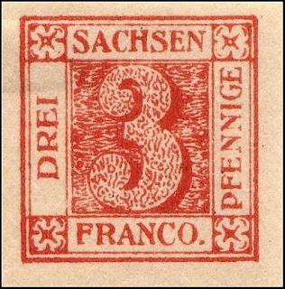
Of all the early European stamps, the Saxony 3pf is one of the most desirable and forged stamps.
The 3 Pf. red originally was in tended for use only as a provisional.
New stamps were in preparation, but it took more than a year before the 3 Pf. green replaced it.
It is called 'Sachsendreier'. It was used for tie wrappers to newspapers, and therefore many of the stamps were destroyed when the wrapper was removed.
About 460,000 stamps were issued, but only 3000 to 4000 are thought to have survived now.
Due to its rarity and demand, a who’s who of forgers made counterfeits. In the "Freimarken des Königreichs Sachsen (1921)", Friedrich W. Dieck mentions Zechmeyer, Goldner, Elb, Fohl, Senf brothers, Thiele & others. A few such as the Martin Schroeder forgery (a Leipzig printer) are excellent and only a few differences mainly in the paper are noticeable.
3 Pf Genuine
Large numeral in a square.
3 Pf. red, brick, cherry, red-carmine.
Imperforate. Typographed. in sheets of 20 stamps
Paper: Thick, yellowish or white.
3 Pf. red, brick, cherry, red-carmine.
Imperforate. Typographed. in sheets of 20 stamps
Paper: Thick, yellowish or white.
1. Right side of A much thicker and longer
2. Right side of H much thicker and longer
3. Top curve of S larger than bottom
4. Part of dividing lines on all 4 sides - not always visible
5. Line made up of dots and dash
6. G is slightly lower than other letters
7. Large blank areas
8. Large lobe
9. Lines cross forming an X
10. C is slightly lower than other letters
11. Large blank area
12. Large curve often connected to design
13. Break in frame line
14. Bottom leg of E longer than top one
15. Break in frame line
16. Large blank area
17. Right rays are very short
18. Bottom part of serif longer than top part
19. Break in frame
20. Right white space wider than left one
21. Right leg of N is raised
Forgeries
Oswald Schroeder Forgery
This is regarded as being one of the best forgeries
Oswald Schroeder (Schröder) was part of the A.Neumann and Schröder printing firm of Leipzig.
These Schroeder forgeries are also sometimes called "Fohl forgeries", since they were printed by Schroeder but ordered by Engelhardt Fohl from Dresden around 1878
They were apparently printed in pairs with 2 types.
In the top (Type A) the line right of the large 3 is broken twice near the top
In the bottom (Type B) it does not connect with the top right floral.
The separator lines are too thin
The serif of the center bar of the F of FRANCO is equal top and bottom
There is a wider space between the A & C and the C appears more inclined
The stamp is lithographed and does not have the edge ink squeeze typical of the typographed original.
Sperati Forgery Type A
There are 2 dark blobs between the lines, one just left of the E of PFENNIGE and one below the O of FRANCO.The top serif of the first S is connected to the body.
The serifs of both I's are too short
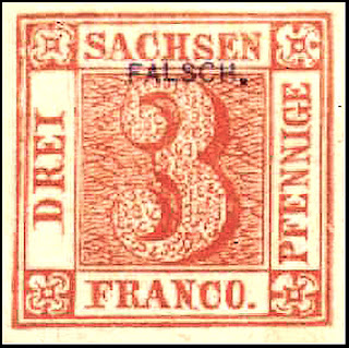
Senf Forgery
The "R" of "DREI" has an upturned tail
The "D" has a very long bottom serif.
The middle stroke of the "E" of "SACHSEN" is closer to the top one
The upper stroke of the "C" of "SACHSEN" almost touches its lower stroke
The first sample has the overprint FALSCH which is typical of SENF forgeries
Forgeries noted by Fritz Billigs in his 1936 book on Saxony
 |
| Billigs Type I |
 |
| Billigs Type III Fournier with typical SEBNIZ iS 15 3 52 5-3 V |
 |
| Billigs Type IV Goldner Reprint - no strokes in corner elements |
 |
| Billigs Type IV - Note the separator lines |
 |
| Billigs Type VI - no dot after FRANCO |
 |
| Billigs Type VII sold $500 in top auction |
 |
| Billigs Type VIII Dot after Pfennige |
 |
| Billigs Type XII Oneglia-Panelli |
 |
| Billigs Type XII Oneglia-Panelli |
Unlisted Forgeries
These are not common but there are many of them in auctions
 |
| An obvious forgery sold for $500 on eBay |
 |
| Top letters too low. Very crude background |
 |
| Top "Dresden" May have come from city promotion |
 |
| Crude forgery, dashes instead of 3's in numeral. Crude background. Thick letters. |
 |
| A hand painted forgery |
 |
| Dashes on numeral instead of 3's. Crude background. High crossbar on H |
 |
| Modern forgery. Crude background. |
 |
| Forgery taken from early French catalog |
 |
| Another modern forgery. Very crude letters Possibly Hialeah forgery. |
 |
| Modern Dangerous in design. Too orange yellow. Feet of H connected. |
 |
| Pair of modern forgeries |
 |
| Forgery with odd corner flowers and very tall letters |
 |
| Very crude design. No 3's in numeral. Uneven letters |
 |
| Very crude forgery. Small top loop of 3. Uneven and tilted letters. Unusual backgrounds |
 |
| Crude rough litho. Letters very uneven. Background in numeral made up of dashes instead of 3's |
Goldner Reprints
Julius Goldner was a stamp dealer in Hamburg (Germany), who sold enormous quantities of reprints
The key feature is the missing dashes in all the corner flowers
Hirschfeld Reprints
All the D's are broken at the top12.25 million were printed in 24 editions so there are a lot of variations.
These color variations make them difficult to distinguish.
The Mi 2I has a much higher CV.
Generally it is sharper in detail and more dense in color
Features
1. Left side of the cross is detachedThese color variations make them difficult to distinguish.
The Mi 2I has a much higher CV.
Generally it is sharper in detail and more dense in color
Proof
2. The left side of the “H” is taller
3. The right side ornament is much smaller than the left one.
4. The numeral “3” on the right is positioned higher.
5. The right curl is incomplete.
6. The right curl is larger and more open.
7. The right ornament is more curled than the left one.
8. Right ornament is much larger.
9. 7 pearls outside
10. Ornament is detached
11. Ornament is detached
Forgeries
Proof ForgeryThe 3's have no middle branch
The cross is tiny and crown narrower
The cross is tiny and crown narrower
Part of the oval projects into the top letters
D is inclined
An odd color forgery sold as a color proof
Lower letters are taller
Sperati right type A
An odd color forgery sold as a color proof
All the side ornaments are ver different
All the letters are thicker
all serifs are short
Top letter are thicker
Type A
1. the top frameline is broken in places and generally weak at left as well
2. the top serifs of the "H" in "SACHEN" are joined
Type B
1. the outer frameline is strong at top left and top, but almost disappears at lower left
2. there is no horizontal stroke on the "A" in "SACHEN"
'The 'A' of 'SACHSEN' has a break at the left hand side and the 'E' of this same word has a break in the bottom.
1851-1852 Mi 3-7
Head of King John I. facing right
1/2 S.Gr. black on grey
1 S.Gr. black on light rose
2 S.Gr. black on light blue
3 S.Gr. black on yellow
2 S.Gr. black on dark blue
Imperforate, colored paper
Head of King John I. facing right
1/2 S.Gr. black on grey
1 S.Gr. black on light rose
2 S.Gr. black on light blue
3 S.Gr. black on yellow
2 S.Gr. black on dark blue
Imperforate, colored paper
 |
| Mi 3 |
 |
| Mi 3 Proof |
Fournier Forgeries
Saxony forgeries sold by Fournier


