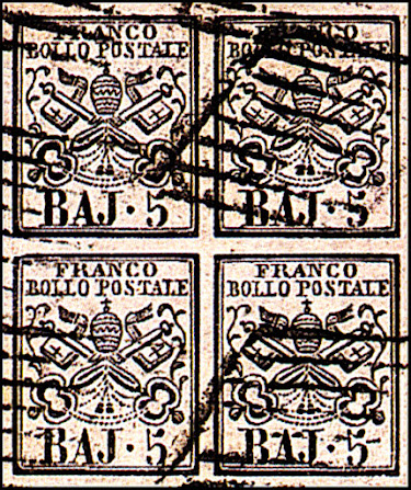
In 1850 the Roman States included Romagna, with the river Po as the northern boundary. The Marshes, to Spoleto in the south, and The Patrimony of S. Peter, together with two Southern Towns, Pontecarro and Benevento.
The area of this district was about 16,000 square miles, and the population over 3,000,000
Catalogs often do not mention the word "Roman States". The general description is "Stati Antichi Stati Italiani" (Ancient Italian States). The stamps to follow are designated as belonging to the "Papal States" (Stato Pontifico) in many catalogs
The first stamps issued in the Roman States were typographed, and were ordered by M. Salviucci, the Director of the Press of the Papal Government.
It was formerly stated that he commissioned M.J. Valagna to manufacture the dies but later authorities state that they were engraved by Doublet and Decoppet of Rome.
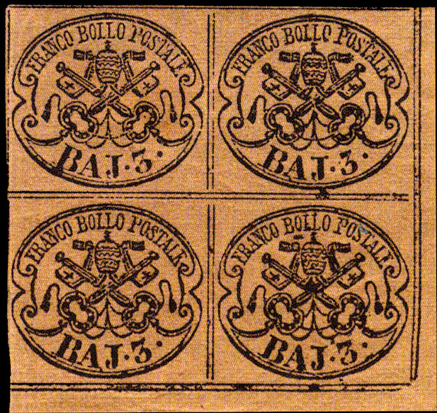
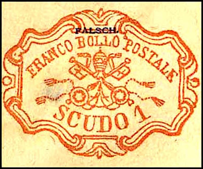
The first issue consisted of stamps of 1/2, 1, 2, 3, 4, 5, 6, and 7 bajocchi, all issued on 1 Jan. 1852, and in October of the same year further stamps of 8 and 50 bajocchi and 1 scudo were issued.
The prominent feature in the design of these stamps is the Papal Tiara and Crossed Keys, the framework and side ornamentation differing in each value.
The paper, made mostly by Cartiera Graziosi of Subiaco, was at first handmade; later smoother and heavier machine-made paper was employed. The values up to 8 baj. were typographed at the Vatican’s own print shop in sheets of 100 (divided into four panes of 25).
The 50 Baj and 1 scudo were printed in sheets of 50 (10×5) without any division into panes.
NOTE - most values are easily found but the prices generally do not match the actual values based on quality.
Stamps that show no frame lines have little value. The more one sees these lines, the higher the value. Any with all 4 lines are worth a substantial premium and quite rare.
Quantities Issued
I cannot confirm that these are accurate but the catalog values match the quantities issued.
Postal Forgeries
In 1855, the 1 b, 5 b and 8 b values were forged in Bologna. The 5 Baj and 8 Baj exist in two different types. Of the 1 b forgery, only three used stamps and one cover are known
All postal forgeries are quite rare so finding one is a big plus.
Overall the postal forgeries are not well executed.
They were probably made by an employee(s) of the printer. When investigators earnestly got on the case, the forgeries suddenly stopped.
1. Cords joining hilts of keys formed of dots instead of dashes.
2. The left key hilt has a round pommel instead or an oval one and lacks the inside line
3. Leaf of vine between the hilts and frame lacking on both sides.
4. A and J of BAJ joined at bottom. B very tall. J too low .
5. O of POSTALE under right side of N of FRANCO.
6. The tiara is an almost perfect oval. Tapered in original.
Below an actual 5Baj Postal Forgery on a cover
The Baj 2 is genuine.
5b Type 2 postal forgerires on as cover - note the wide margins
The 8 Baj Postal Forgeries Type I & II
Records indicate the Type I was only used for a few months and the Type II for a little over 1 year.
These are very rare and worth more than the originals
The black dot on the frame left of the left handle is a constant feature of the Type II
Below an actual cover section with 3 8Baj Type II - arrow indicates the frame dot
Genuine Stamps & Forgeries
Aside from the 1/2 Baj, 50 Baj and 1 Scudo, most forgeries are not that common.
However they were produced by a wide group of forgers and some are quite dangerous.
Cast of characters included: Fournier, Spiro, Zechmeyer, Nber, Sartori, Senf, Torres, Sperati, Oneglia, Winters and others
Later issues "reprints" included North, Usigli, Gelli & Tani, Cohn and Moens
NOTE: I do not have samples of all their works, so I am concentrating on the genuine characteristics to assist in identifying forgeries. However, there were many printings with various quality issues SO not all features apply in every case.
1/2 Baj
Genuine Stamp
1. Top & bottom of the C are flat
2. The left side flag section is shorter
3. This L is taller than the previous one and the top serif is curved
4. The top section of the S is smaller
5. The left branch of the T is often visibly broken
6. The TAL letters are joined
7. The base of the O is often broken
8. Generally a line break here
9. The A has a dented top and a long right foot
10. Generally a break here
11. The end of this shape is generally open
12. The RAN letters are joined and the N often shows weak areas
Above genuine block - Black on Violet/grey
 |
| Genuine Black on Grey |
Forgeries
1. The C of FRANCO is odd.
2. The key handles are too large and don't have pearls.
3. M and Z's of MEZZO are oddly shaped
4. Letters are not joined
This forgery appears in different colors and cancels.
The above is stated to be from Zechmeyer
The white space in the 'A' of 'BAJ' is completely missing.
The genuine stamps have double dividing lines, but in this forgery they are single.
Design touches the pearl frame.
From unknown forger
Very irregular letters
Large keyhole openings
Other forgeries have issues with the keyhole along with letter sizes and shapes mainly the C & S.
1 BajGenuine Stamp1. Second L is taller
2. Top of P is generally broken
3. Top of S is smaller than lower half
4. TAL normally joined
5. Key separated from shaft
6. Loop is not near or touching the key
7. Bulge and thick line
8. Bulge and sometimes a break in the edge
9. Top of 1 is dented, little or no serif
10. Top of A is flat
11. Serif points upwards, lower one points downwards
12. Bulge in line
13. FR often broken
14. RAN letters joined
The 1 Baj can be found in 2 types depending on the dividing lines direction
Below blocks showing the printing variations between stamps
Forgeries
1. The BAJ letters are coarse and very different
2. The 1 has a curved foot
3. Most important - the frames are not continuous in any one direction
This forgery is very good
1. Many of the top letters are different
2. The openings around the key handles do not match the original
3. The right tassel is too close to the key
4. The connections between the keys have too many solid lines instead of dashes
2 Baj
Genuine Stamp
1. The end of the N extends
2. Note the width of the tiara
3. The L is larger than the previous one
4. The P has a wide curved foot
5. The top of the S is smaller
5a. The line is sometimes broken
6. Curved bars over the emblem
7. The serifs are sometimes not attached
8. Curved bars the left one tends to be thicker and shorter
9. Check the bulb position
10. The bottom is very thin and sometimes broken
11. The FR are joined
12. Wide cog here
13. Key handle is more oval than round
Above color variety
Above genuine block
Genuine color variation
Forgeries
Overall very crude
The key handles and top corner ornaments are very different
The top letters do not match
This forgery is reported to be from Senf but it matches exactly the image in the Torres 1896 forgery catalog
The top corner ornaments are very different
The bottom letters are wide
The key feature is the double dot before the 2
1. The FR is joined at the top
2. The RNC are joined
3. The C is flat on the bottom. I have also seen the C attached to the O
4. The L appears inclined
5. The top is smaller than the bottom and the serif is much smaller
6. The bottom leg extends and is slanted
7. The dot is central with the 3
8. The end is pointed & the center points downwards
9. The bottom of the J is very thin
10. The curl unlike the right side ends in a large form
11. The key end is oblique
12. The openings are large
Above genuine block in Chrome yellow
Above genuine block in in bistre orange
Forgeries
1. The top of the 3 is shaped wrong
2. The rings in the handles have too many holes
3. The A in BAJ is poorly drawn
4. The tassels besides the handles are the wrong shape
5. The tiara is too narrow
1, The holes in the handles are too small
2. The top of the 3 is too thick
3. The key touches the handle on the left side
A very crude forgery - Zechmeyer?
Very little is correct with this forgery
A very primitive forgery
Genuine Stamp1, Second L is larger and often broken
2. The top of the P is flat
3. The top of the S if flat the bottom is sometimes broken
4. TAL are joined
5. The top serif points down to the right
6. The bar is curved upwards
7. The top left serif points upwards. Note the width of the bottom
8. The top of the F is often broken
9. The FR are joined
10. The top of the C is flat and sometimes broken
11. Generally a break in the line
A genuine block
Forgeries
1. A Behrmann 1874 forgery
2. Very wide J
3. Odd serif on the C of FRANCO
4. The tiara is oval shaped
5. The branches of the tassels besides the tiara are curved
1. A Zechmeyer crude forgery
2, The BAJ 4 are poorly made
3. The keys touch the handles
5. The top letters do not match
Another Zechneyer forgery
1. A rather crude forgery
2. The BAJ 4 is poorly drawn
3. The top letters are too tall and large
4. The key handles touch the frame
5. The bottom tassel is very large
Large AJ
4 almost closed at thetop
1. The L's are joined and the second one is larger
2. The RAN are joined
3. The TALE are joined
4. The S appears slanted and the top is much smaller
5. The leaves are different sizes
6. The leaves aee different shapes
7. The right side serif curves upwards
8. The serif is connected to the frame - a key feature
9. The side of the 5 is slightly slanted
Genuine 5 baj block
Forgeries
1. Fournier forgery - dangerous
2. The key feature where the lower B serif is curved to the frame
is missing
3. The S in POSTALE is different
Spiro forgery
1. Large dot on both sides
2. FR joined at top
3. RAN joined at bottom
4. Second L is larger, top of first one is inclined
4a. Top & bottom of the S are not the same shape or size
5. TALE are joined at bottom
6. The end is higher than the left one
7. The dot on the right is smaller than the left one
8. Generally open here
9. The 6 is generally open at the top. Part of the left side may show up as a dot
10. The crossbar tends to be slanted
11. the inner line tends to be weak as is the B bottom serif
12. The foot of the P is not perpendicular to the shaft and the top serif points upwards
13. This dot appears to be constant in the originals I have seen
6 baj lilac block
6 baj pearl gray
Forgeries
1. A rather poor forgery
2. The top letters are all together with no spacing
3. The BAJ 6 is thick and shaped wrong
4. The tiara is too small as are the key ends
2. The BAJ 6 is a different shape
3. The left key handle touches the frame
4. The top letters are too close together
5. The tiara cross touches the letters
6. The key ends are too small
1. This is classed as a Moens but I have some doubts
2. The top letters are too short with several inclined
3. The holes in the handles are too small and numerous
4. The left ornament touches the F
1. A Spiro forgery
2. The top letters are too close together
3. The left foot and right side of the A in BAJ are too thick
4. The 6 is too tall
5. The holes in the right handle are much too large. The left one has too many
6. A very narrow tiara
1. A Torres forgery
2. Too many holes in the handles
3. The top letters are very irregular and oddly shaped
4. The sprigs on the sides of the value are to long and thin
5. A large very thin unattached cross
Poorly executed
Riund ketholes
Large 6
Overinked
7 Baj
Genuine Stamp1. The top of FR is joined
2. RAN is joined together
3. The lower left serif points downwards
4. TALE joined together
5. The tiara has a uniform egg shape
6. The bottom serif is large and the top one is inclined
7. The shading in the rings is in a different position
8. The tip of the 7 is pointed and inclined
9. The bottom of the J is very narrow
10. The left serif is longer
7 baj blue block
Forgeries
On auctions, this is one of the more common stamps available so it is no surprise that there are a lot of forgeries on the market as most of these are generally fairly well done.
1. Odd letters on top, the serifs on the F and B, the shape of the POS and the wide space between the S and T
2. The bottom letters are joined
3. The wing shaped ornaments are too large and the right side one is attached to the 7
4. Pear shaped tiara
1. Fournier forgery rather dangerous
2. Some top letters are slightly thick
3. The winged element right of the 7 is too thick
4. The 7 has an odd shape - constant?
5. Lots of extraneous and lack of detail in the keys
1. A Senf forgery without the usual "Facsimile" overprint
2. The top letters are too thick
3. The bottom letters are shorter
4. The wings on the left side touch the frame line
5. The left side shaft is hardly connected to the key end while the right one is overly connected
1. Spiro forgery - a poor copy
2. The tiara is pear shaped
3. Key feature - the dot before the 7 is too low
4. The AJ are joined
5. Top letters are irregular especially the FRANCO
Attributed to Senf
A similar forgery appears on a advertisement from Oneglia
Top letters too low
7 diferent from original
8 Baj
1. Breaks in these corners are common
2. The O is small
3. The L's are joined and large
4. The PO is generally joined
5. The S is very narrow
6. The letters TALE are joined
7. These tassels are generally not attached
8. The 8 is evenly shaped with a common break in the middle
9. This line is often broken
10. The J is somewhat pointed
11. The crossbar is slanted
12. The FR is joined at the top
13. The RAN are joined at the bottom
14. Break in corner
15. Not attached
16. N often broken
17. Large dot and high peak besides it
A block showing the dividing lines
Forgeries
1. Senf forgery 1875 but also identical to Torres forgery listing
2. Odd looking BAJ
3. 8 touches key handle
4. Distorted tiara
5. Top words not separated
1. Zechmeyer forgery - very crude
2. Thick distorted letters
3. No semblance to original
Source Unknown
1. The even frame with no breaks if the key feature
2. BAJ* thinner than original
3. FR larger than other letters
4. No separation in the last 2 words
5. J has a wide foot
Torres Forgery
1. No separation in top words
2. No serifs on BA of BAJ
3. Lopsided tiara
4. Key handles are rounder
5. Large ornaments on key shaft
50 Baj
The genuine is found in 2 distinct colors Blue and Ultramarine
Genuine Stamp
1. Line generally broken here
2. Generally open on this side
3. TAL joined
4. Often a dot here or the E will have a left serif
5. Rounded top of the E
6. Inner often broken or dotted line
7. Little or no inner shading
8. Top of the 5 is short very curved and pointed
9. J serif is curved
10. Generally a break here
11. A serif are curved
12. RAN joined
13. N often broken
14. 2nd L is larger
15. The short dashes are perpendicular on the left side but slanted on the right side - this is often missed on forgeries
16. Generally missing dash(es) here
17. Bottom of S is flat
Forgeries
This stamp has many forgeries
1. A crude forgery
2. Top letters are uneven and not joined
3. The 5 top is wrong
4. A serif attached to frame
5. Dashes under value are blotchy
1. A very good forgery from an unknown source
2. The serif on the J is straight and the end ball is large
3. The left lower dashes are inclined
4. The top letters are tall, the RAN and TAL are not joined
5. The 2nd L is much taller
2. Far too many dashes around the frame
3. The tassels have ho definition
4. The tip of the chains linking the handles if off center and uneven
5. The tip of the 5 is too long and high
1. There is a large blotch on the lower left leaf.
2. The dashes under the value are heavily slanted right
3. The 'J' of 'BAJ' is slanting backwards and has almost no top serifs.
1. No breaks in the frame lines
2. The top of the 5 is thick
3. C of FRANCO is large
4. Large high tip on the 5
Advertised and sold as a genuine for a high value
Both of these are classified as Fournier forgeries.
Fournier based on the original source was known to advertise "regular" and "premium" forgeries based on the quality
On the top one:
1. Top letters are too tall
2. The tiara has almost fully shaded bands
3. All the bottom letters and the 5 are wrong
The bottom one is actually better
1. The 5 top is too short
2. Blotchy and missing dashes
3. The tiara is touching the tassels
This forgery is identical to the previous one but the cancel matches a Venturini cancel. It may be a Fournier forgery sold to him and then canceled.
This is a dent forgery but it lacks any breaks, the lower left dashes point the wrong way
The key feature is the frame which is not present in the original
Overall this forgery is "too fresh" and is probably modern.
1. A Spiro well done forgery
2. The top of the 5 Is too thick
3. The 0 is too large
4. The mid line in the corner leaves os long and unbroken
5. Line breaks are missing
1. A Zechmeyer forgery
2. Very tiny tiara
3. Corner leaves oddly shaped
4. Top letters are thick, uneven and some the wrong shape or slanted
1. Sperati excellent forgeries in both colors - they command a premium over originals
2. there is a small break in the the upper loop of the B of BAJ
3. . the top left serif of the E of POSTALE is broken away
4. The lower left dashes are blotchy
5. The shading in the tips of the top right leaf is not as pronounced as in the original
1. Lines do not touch the frame
2. Generally a dot here
3. The key is not attached to the handle
4. The 2 lines dot not connect to the frame
5. The L's are generally attached
6. Always a dot/dash here
7. TAL letters are joined
8. The serif of the E is slanted
9. The bottom is flat
10. UD is joined
11. The top of the C is flat
12. The tip of the E is in perpendicular line with the ornament tip
13. The line is generally broken
14. Tip of tiara is separated
15. Serif is long, thin and curved
16. Rings have no inner shading
Genuine block in red
Forgeries
1. Zechmeyer forgery - typical coarse features
2, LO has a line going through the letters
3. The F of FRANCO has no upper serifs.
4. The B has a curved top left serif
5. The S of SCUDO has a large serif
6. The cancel is a bogus one consisting of parallel lines.
1. The serifs on the S of SCUDO do not match
2. Likewise the UD are different, the D is skewed
3. The serif on the 1 is very short
4. The F of FRANCO has no foot
5. The cross touches the L and leans right
6. Given the appearance and cancel this may be a Spiro
1. This forgery has many blotchy letters
2. The letters in SCUDO do not match the original
3. The foot of the 1 is curved
4. The bottom ornament is detached
1. The top and side ornaments are all detached
2. The letters SCUDO are shorter, the top of rhe S is not proportionate
3. The first L is slanted backwards
4. I do not know if the long line extending from the bottom left is a constant flaw
1. This forgery is crude
2. The top words are too close to each other
3. The D of SCUDO is too round
4. The 1 has a short serif
5. There are 2 colored dots over POSTALE
1. This is a fresh modern forgery possibly from the same source as the 50 Baj
2. There are several breaks and spots in the top left outer frame
3. The CO appears joined
4. The B is shaped differently
1. This crude coarse forgery is attributed to Oneglia but the poor quality is not his usual work
1. A good forgery attributed to Senf
2. The shading is missing in the middle left ornament
3. The U is uneven
4. The tassels have a fork like appearance
5. The D is tall
6. The P has an odd serif
Another typical Senf forgery

Large crown on top and bottom
Guide line all around
Odd looking keyholes
1. Forgery attributed to Peter Winter (1980's)
2. Some letters do not match such as the C, B and S above
3. There is a large break in the line below the D
4. The inner ring of the right handle is missing the cogs
1. A Torres forgery
2. The D is large and the O is too round
3. The cogs inside the handles are crudely done
4. At the top the first L is inclined
5. All the tassels are small and poorly drawn
Zechmeyer forgery with bogus cancel
Poorly designed old forgery
Note guide lines all around
1. A well executed Sperati
2. There is always a break in the inner frameline below the C" of SCUDO
3. The left bottom part of the A of FRANCO is curved instead of straight as in the genuine stamps.
4. There is no top left serif to the E of POSTALE
Precancels
The Direzione Postale di Roma put pre-cancels stamps on covers addressed to the Roma district until December 1863.
Typical cancels were used including pen strokes.
Their cost was reimbursed to the postmen upon mail collection.
Covers with these stamps obviously do not have cancel marks on the cover itself.
The pre-cancelled corner 25 of a 100 stamp full sheet
"Lilliput" Frankings
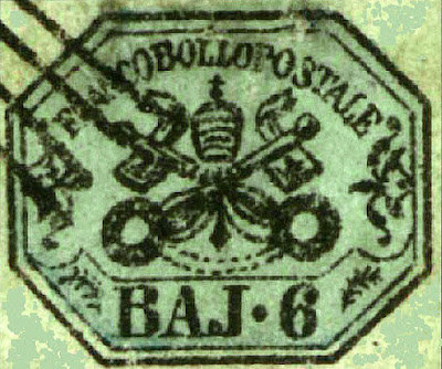
An interesting type sought after by collectors given the name Lilliput.
Senders would cut the edges of stamps into octagonal shapes.
Unless on a rare cover, fakes would obviously be easy to reproduce.
Addendum
The following are from the Geneva Fournier collection
Fournier did not create these but only sold them
Various Fournier Cancels


