

Overall, forgeries and fake overprints greatly outnumber every genuine stamp in the first 6 years and there is scant information.
The following far from includes all the issues and overprints but the main ones are covered
December 2, 1918.
The first Rijeka-stamp. The black hand made "FIUME" overprint on the Hungarian 20 filler postage stamp of the "harvesters" set.
The overprint was produced at the printing workshop of Adolf Kirchofer & Co. in Kirchofer Rijeka on three sheets (100 stamps each).
Apparently, the overprint was later rejected, but a part of the stamps was sold in the post office of Rijeka, making the stamp the first stamp of Rijeka.
This is rare stamp that must be certified (recently). The original hand print is simple to ID and no subsequent fakes appear to be dangerous

Above, genuine stamps

Top genuine, bottom typical fake
The genuine has tall letters with rounded ends with very black inking.
Generally the top of the word appears to be curved.
The left side of the M is generally filled in or almost so.
1918 December 3 – 23
The machine-made and hand-made "FIUME" overprint on Hungarian stamps of 1916-1918.
The stamps used included:
Hungarian charity stamps of 1916
Hungarian postage stamps of 1916-1917 (harvesters and parliament)
Hungarian postage stamps of 1917 (white numerals)
Hungarian postage stamps of 1918 (Carlo and Zita)
Hungarian newspaper stamp of 1913
Hungarian special delivery stamp of 1916
Given the quantities and timing, the Adolf Kirchofer & Co. was unable to meet the demand and the job awarded to the Fiume based Urania printing workshop, where stamps were
machine (letterpress) overprinted. Urania printing workshop had
The company prepared two plates for machine overprint of the needed stamps. One for smaller stamps of lower denominations of the Harvesters series and one for larger high denominations from the Parliament series.
The main differences between these two types of letterpress overprints is the ink that was
used, and the light to somewhat pronounced fuzzy edges on parts of the Type 2 overprint.
First type of machine overprint was carried out with two new, clean plates and high quality ink. The color of the overprint is gray black, crisp and dry, and the serifs of the letters very thin and straight.

The Type II is slightly thicker especially in in the foot and top serifs as well as having some fuzzy edges.
The key feature to distinguish these from the vast number of forgeries are the pointed ends to the serifs and the point where the middle legs meet.
Forgeries
There are dozens of variations of these forgeries so it is impossible to list them and show the differences.

 Typical forgery above
Serifs point in the wrong direction and tend to be rounded not sharp


They range from crude to good but none are very dangerous.
By applying the features of the M above, one can eliminate 90% of them
Below the full original machine ovpt. with areas that need checking.
Note how serifs differ, slant and thickness


Serifs point in the wrong direction and tend to be rounded not sharp
The right side of the U is too thick
The middle of the M is too low and not pointed
NOTE - The hand made overprints will be added at another update.
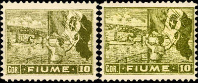
1919 January 30 to April 3, 1919.
The first issue of Rijeka-postage stamps. The stamps were printed in four print runs, and differ by paper they were printed on.
They all have the FIUME inscription and were printed in lithograph by Zanardini of Trieste.
The subject on the stamps, drawn by R. Pitteri were: the head of a woman as the symbol of Rijeka – the queen of the Kvarner Bay, the city Clock, the symbol of revolution – the monument to Garibaldi in Italy and the Italian flag in the port of Rijeka.
The line perforation are 11.5 and as produced on different perforators we have sharp and blunt perforations. Genuine issues below.

Forgeries


The forgeries (right) are easy to detect
The star is narrow and lopsided
The numerals are narrower
The letters are shorter with rounded ends
The middle leg of the E is shorter in the forgeries

The clock face has few lines and poorly drawn
The base of the 1 is wrong
The building to the right appears to have an extra window
The letters are thinner with some rounded instead of flat ends

It is far better executed than the previous forgery
The key features are missing lines, details and white spaces.
In particular note those the the right and bottom of he clock as well as the white spaces at the top of the dome.
There are minor issues with the letters such as the longer arm length of the E
 This forgery is well executed
 Types I , II, III

 On this forgery the difference in the small type right of the ship is very different, Aside from not being clear, several letters are tilted or not uniform.

The diagonal background lines have many breaks and a large white area
The extension out the left shoulder is missing
There is a dash between the tail and robe
Details in shading lines are missing
 Type I forgery


Very crude execution
The flag cross is misshapen
The sailor's cape has blotches and missing lines
Overall details and shading are missing

Type II forgery
Well executed and dangerous
Generally the shading tends to be heavier
The key feature is the small crack in the joint of the cross
NOTE - some experts mention a Type III but I have no specific details other than the same crack in the cross

 Types I, II, II
 Types I, II
1918 Dec. 2 - Newspaper Stamps
These present some ambiguities for collectors as they assume there is some forgery.
Actually they are just different printings.

Left - Litho by Zanardini & Co. of Trieste. (18 July 1919):
There are feathers between eagle’s leg
The characters are smaller.
Right - Litho by Bertieri & Vanzetti of Milan. (1 September 1919):
There is an empty space between eagle’s legs
The characters are larger
1919 October 9
Hand overprint FRANCO and new values on stamps of 1919
Overprints FRANCO 5, FRANCO 10 and FRANCO 15 exist in various types but are generally the Type I for each value
As the fakes are very plentiful and diversified, it is simpler to describe the genuine overprints below.

Type I:
Uninterrupted line from F to N
Oval loop of letter R
Vertical stroke of letter A is horizontal.
Type II:
Line from F to N interrupted,
Loop of the letter R oval,
Vertical stroke of letter A horizontal.
Type III
Line from F to N interrupted,
Loop of the letter R round,
Vertical stroke of letter A is slanting.

Type I:
Line above letter A interrupted,
Horizontal line in A slanting.
Type II:
Horizontal line uninterrupted,
Horizontal line in A straight.

Type I:
Letter N with serif at top left,
Loop of letter R round
Numeral 5 thick and wide.
Type II:
Letter N without the serif
Loop of letter R oval
Numeral 5 narrow
Letter F short at bottom.
Type III
Letters thinner as in Type 2
Letter F bottom aligned with the letter R.
1919 May 18 - Semi Postals
The surtax aided Fiume students in Italy. "Pasta di Fiume" is printed on the back of B4-B16.
 |
| Original set |
Forgeries of the Semi-Postal stamps
Genuine left, forgery right

These are excellent forgeries. The wording under the table is not clear. Shading lines are lacking and some serif ends are different

The background lines are heavier and a lot of white areas are visible.

A NOTE ON OVERPRINT FAKES
Géza Tarján, a stamp dealer with offices in both Hamburg and Vienna arranged to meet the demand for overprints and especially the higher value overprints. Heinz Pape was the managing director of Tarján’s stamp company’s branches in Vienna and Hamburg, and acted as the stamp expertizer as well. Tarján made his own fraudulent copy of Pape’s expertizing mark, then printed his forged overprints on the face of the stamp, turned them over, and stamped Pape’s mark on the back of each. If the stamp as this mark, it is probably a forgery. Another mark to beware of is PETRIK.
Again, rather than show forgeries, I will post for comparison the genuine overprint types I have;

Type I
Letters large and thin.

Type II
Letters smaller and thicker
Distance between the dot after Cent and the numeral is 1,5 mm.

Type III
Letters smaller and thicker

Type I
Letters small and thin.

Type II
Larger thin letters.

Type III
Letters smaller and heavier.

Type I
Letters large and thin.

Type II
Letters smaller and Thicker
1920 Sept. 12
Definitive issue: Gabriele d’Annunzio.
Postage stamps were printed letterpress by Bertieri & Vanzetti of Milan perforation line 11½

Genuine
O in PO is roundEyebrow has 2 lines
Overall details are distinct and fine

O in PO is oval shaped
 Genuine stamp
 Forgery
Eyebrow has 2 lines
 Type II Forgery
Overall details are distinct and fine

O in PO is round
Eyebrow is very blotchy
Overall details are coarse
 |
| Set of Type II forgeries |
1920 Sept. 12
Special delivery stamps were printed litho by Zanardini & Co. of Trieste. 11½ line perforation.


The head of the rider has no features
There is a break near the hoof

1920 Sept. 12
The commemorative issue marking the first anniversary of the arrival of D'Annunzio's legionaries in Rijeka. The drawings were made by Adolfo de Carolis according to D'Annunzio's idea.
Printed litho by Danesi of Roma. 11½ line perforation.
First we can look at the stamp headings that primarily differentiate the genuine from the forgeries

Genuine


Genuine


The design is coarser and the white letters are thicker


A much coarser design with thicker letters


1920 Nov. 18 - ARBE Overprint
The Fiume Legionnaires of d'Annunzio occupied the islands of Arbe and Veglia in the Gulf of Catnaro Nov. 13, 1920-Jan. S, 1921. Some have a new value added.


Fake overprints types


1920 Nov 18 - VEGLIA Overprint
The overprint on Nos. 128-131 comes in two widths: 17mm and 19mm
 |
| 17mm overprint |
 |
| Uncommon 19 mm overprint |
As with other overprints, expect the fake overprint on a forged base stamp.


1920 Nov. 20
Black and red overprint Reggenza Italiana del Carnaro (Italian Regency for the Kvarner Bay) on the military stamps.
Overprinted letterpress by Urania of Rijeka

The key to identifying the forgeries is with the base stamps as very few if any overprints are on genuine stamps

 Genuine print
So one can use the original series shown earlier as a guide.
1920 Nov 20 Back Printed stamps
Several stamps in the series have a circular snake backprint.
These are the more valuable types and many forgeries exist


Fake overprints


1921 Feb. 2
The Governo Provvisorio (temporary government) overprint on stamps of the Gabriele D'Annunzio set.
3 Printings.

1st overprinting by Vedetta d’Italia in Fiume, 21.2.1921:
1. Overprint black
2. Spacing between o and v in Governo is usually wider, only on two stamps in a pane the spacing is equal
3. 3 mm distance between Governo and Provvisorio

2nd overprinting by Vedetta d’Italia in Fiume, 26.8.1921:
1. Overprint gray-black
2. Wider spacing between o and v in Governo
3. 3 mm distance between Governo and Provvisorio

3rd Overprinting by Bertieri & Vanzetti in Milan, 18.12.1921:
1. Overprint dark black,
2. Even spacing between o and v in Governo
As with the other overprints, fakes abound but according to most experts a fake overprint is only found on an occasional 1 Lire stamp.
Identifying the underlying stamp is therefore the key.
1923 Mar. 232
Regular issue of the motives and panoramas of Rijeka from the 17th century on special delivery stamps. Drawings by Guido Marussig.
The stamps were printed in two colors, of which the first one is a tint.
Printed letterpress by Bertieri & Vanzetti of Milan. 11, 11½, 11×11½ or 11½×11 line perforations

The O of POSTE is oval shaped instead of round
The lines separating the sails are thicker
The cordage is not well defined
NOTE - there is another type of forgery for all stamps in this series with a round O but it is on coarser rough paper and the overall features are not as distinct as the genuine.

The key features of the forgery (right)
The O of POSTE is oval shaped instead of round
In the genuine the bottom horizontal line on the right wall is interrupted but not on the forgery.
Many features in the stonework are different

The O is oval shaped and the right bottom line is interrupted.
However the cracks are thicker than in the genuine
 The key features of the forgery (right)
 This is probably a Type II forgery

The O of POSTE is oval shaped instead of round
The rays of the halo are complete but only partial in the genuine stamp

The rays are complete but the O is round not oval
Also note the head and face are very different

 Genuine stamp
 Forgery


The key features of the forgery (Type I right)
The O of POSTE is oval shaped instead of round
The forgery image is slightly shorter 27.5mm vs. 28.5mm
In the genuine the A of TARS has a small dot , the forgery has a small triangle
The detail lines are thicker in the forgery and several are missing


The dividing line on the hill does not match tghe original
The window is set lower
 As with other overprints the fake is printed on a forged stamp.
The Fake Type I below, the R leg is thin and pointed. the E top is flat
1924 Feb 2

The complete forgery on the right is easily identified by the oval O in POSTE
The fake overprint is a Type I
The differences can also easily be identified by the first 2 letters of REGNO
In the genuine the leg of the R is thick and has a rounded tip, the top of the E has a slight incline - see below


The Fake Type II below, the R leg is evenly sized and end rounded, The top of the E ends in a blob as does the middle arm

Addendum
A closer look at the clock tower
Genuine

Very rough overall
Note 4th window on the rihjt
 Forgery Type 2

Slightly rougher
Broken lines left of clock face
NOTE - there is also a Type 3 very similar to Type 2 but on rougher paper

No comments:
Post a Comment
THANK YOU for the feedback. Your comment will be reviewed and appear on this blog within 24 hours
Do you have any pic to share? Use this code [img]your-image-url-here[/img]