- Except for the last issue, all the stamps are lithographed. The same method used by forgers
- The various differences in size of the several issues depend on, how much the paper was dampened, and how much it contracted again after printing.
- Copies with original gum of the first issues are usually to be regarded with mistrust, for there were no stocks of leftovers, and so unused copies with original gum are very hard to find.
1852
1/30 Thaler Black on Dark Blue
Imperforate. Lithographed.
Size of stamp picture: 17 , by 20 mm.
1,500,000 printed
There are 4 types of this issue (some argue that there are sub-types). Each has its own characteristics.
Type I
1. Dots in crown
2. Foot of “r” extends outwards
3. “1” touches the ermine
4. Bottom of “3” wider than the top
5. “H & A ” joined
6. ‘Top of “U & R ” joined
7. Distinguishing feature of Type I
8. Spike in bottom of “G”
9. “5” much broader at the bottom
10. “2” touches the frame
Type II Size is 18 X 20 mm
General traits same as Type I
1. “2” does not touch the frame
2. Bottom of “3” not as wide as Type I
3. Key feature of Type II
4. “H & A” joined
5. Key feature of Type I
Type III1. Bottom & top of “3” same width
2. “H, A and L” joined
3. Tip of shield extends further in scroll than Type I or II
4. Key Feature
5. Key feature – narrow opening in fold
Type IV
Basically the same features as Type I
1. “2” does not touch the frame
2. Key feature – shading in loop
3. “U and R” much shorter the first letters
4. Key feature
Forgeries
Crude forgery
“THALER” too wide and cut off, bottom and top of “3” even
Bottom lettering very crude, heavy coarse shading
A good forgery
Shield cut off on the right side
“1” does not touch the ermine
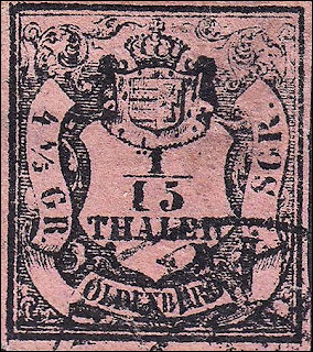
1/15th
Same design as before.
1 / 15 Thaler black/rose. Type I , II and III.
Imperforate. Lithographed
Size of stamp picture: Type I: 18 X 20 mm. Type II : 18 X 20 mm.
350,000 printed
General Features
1. Top of “1” does not touch the ermine, the top line extends to the right
2. The top line extends to the right
3. Bottom of “5” is very wide
4. The “H, A and L” are joined
5. The tip of the shield does not enter the scroll below
6. The end of the ’2” has a sharp curving tip
7. There is a dot inside the ornament
8. Large “4” does not touch the frame
9. Small “4” does touch the frame
Type I
Type III
ForgeriesA good forgery
The small”4” does not touch the frame
The “1” does not touch the ermine
The bottom of the “5” is flat There is a period after "OLDENBURG"
Apparently sold by Spiro
A very crude forgery with a long list of issues – note the very thick border
Peter Winter 1980's forgery
A very good forgery
The outer frame line is irregular
1/10th
Same design as before.
1 / 10 Thaler black / light yellow, lemon-yellow. Type I and II.
Imperforate. Lithographed.
250,000 printed
 |
| Original |
ForgeriesGPS Type I
Lithographed Spiro
T & R touch the frame
Letters of THALER not joined
GPS Type II
The crown is completely wrong
The numerals and letters are too small
The 1 touches the bottom of the ermine
The ends of "THALER" touch the shield
Forgery GPS Type V
No period after "OLDENBURG"
Odd crown with 3 circular openings
The right 3 is too small & thick
Background shading not made up of horizontal lines
1855 1/3
Imperforate. Lithographed.
Paper: Medium strong or thin.
200,000 were printed
1. Dash in ornament
1a. Thin frame line cuts off the cross
2. 2 dots in bottom of cross2. 2 dots in bottom of cross
3. Tip of “1” does not touch the ermine.
4. End of “C” is long and points up
5. Bottom of “3” is flat
6. Large dot very close to shield frame
7. Same size dot as 6.
8. Tip of shield cuts the scroll line and is over the center of “N”
9. Serif of “G” touches the line
10. Bottom of “LD” joined
11. Left frame line more inclined than right side
12. Note large dot position and touching 3 shading lines
13. Thick lines on right sides of ribbons
14. Small T shape at end of “4”
ForgeriesLittle shading in scroll besides “OLDENBURG”
Several side letters touch the frame line
Thick outer frame line
GPS forgery type II
The G of "OLDENBURG" is too low
There is too much space between the 3 & b
The ch on the left side are joined
GPS forgery type III Spiro
"OLDENBURG" is in a curved banner
The top of the G of Gr is thin & pointed
Sperati Type B on the right, original left
The B of "OLDENBURG" is cracked where the two loops join
There is no extra black dot below the serif and attached to the G
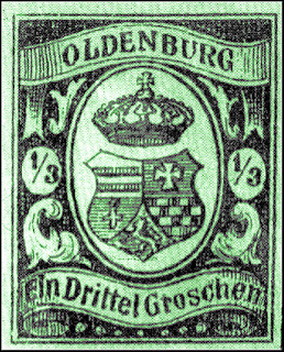
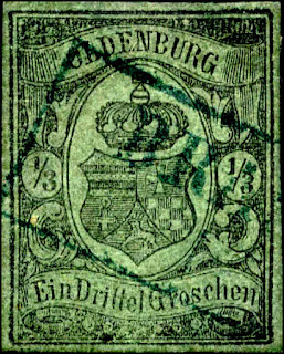
1/3 1859
Coat of arms of the State of Oldenburg with crown.
1/3 Silbergroschen black/green.
The number issued varies between 50,000 and 90,000
A rare & high CV stamp in both used and unused
1. The thin frame line has a break here
2. The left leg of the “N” is long
3. The “G” is small
4. The frame lines are not parallel and are wider here
5. There is a dot, on some it is barely visible
6 & 10 Note the difference in the shapes in size and ends
7. The “S” is large8. the “C” is small
9. The bottom line of the “E” is generally broken
11. Both tips of the left ribbon are pointed
Forgeries
Given the high CV, this stamp was a prime candidate for forgery with some 15 varieties with most being crude.
Forgery GPS Type I
The G of "Groschen" is tall & thin. The c and lower portion of the h are too tall
In both fractions, the 3 is very tall
Forgery GPS Type IV
The letters of "OLDENBURG" are too small and the top of the cross lies under the "E".
The bottom of the shield points between "Drittel" and "Groschen".
In each fraction, the "1" (nearly) touches the fraction bar and the "3" is too large.
The right lobe of the shield does rot protrude sufficiently and is too far from the oval frame
Forgery GPS Type V
In ''OLDENBURG", the "N" lies directly over the top of the cross but is much too large, as is the "O".
The bottom of the shield points between "Drittel" and "Grosechen".
All letters and numerals are too thick and coarse.
The top of the shield is excessively curved.
Another version of Forgery GPS Type V
Forgery GPS Type VI
A fantasy accredited to Spiro
A huge crown
Ornaments on the sides not present in the original
Forgery GPS Type VIII
There is a wide space between the G & r
The numerals are thick
No shading lines in ornaments on side of shield
Odd looking ball beneath cross
Forgery GPS Type X
In OLDENBURG, the top of the "N" leans over and touches the "B",
The space between Drittel and Groschen is too wide.
The space between the two large oval frame lines is too wide.
At the bottom center, several of the circular ornaments arc missing.
The right "3" is much too large.
Billigs Type VI
Very small top letters
Right 3 is inclined
Thin lower letters
Despite the obvious differences in the numerals, thick letters and different crown, this bad forgery sold for $800 on an auction
Forgery GPS Type XI
Known in black on green paper resembling the original.
The crown and the shield arc too high in lire central oval; the crown touches the oval at top and there is too much space below the point ot the shield.
The fractions of value are too low in their ovals, particularly at left which is larger than the right one.
The curving ornament above GROSCHEN is too narrow.
Forgery GPS Type XII - Peter Winter used
All excellent imitation in black on yellowish green paper produced by Winter of Bremen in the 1980rs.
The fine shading lines, especially in the top and bottom banderoles, are more interrupted than in most originals.
The head of the "G" of GROSCHEN drops downward slightly at the serif rather than continuing upward.
This forgery mimics all of the frame line extensions and connections seen in the original
Exists "unused", "used", "on piece" and "on coved' (front), sometimes with a boxed Bremen "cancel" in red and usually with "Replik" on the reverse.
Peter Winter unused
Sperati Type A right compared to genuine left
The bottom frame line extend to far to the left (both types)
There is a white dot in the lower portion of the "1" of "1/3" at right side
Sperati applied forged cancels "NEUENBURG 6/2", "NEUENBURG 15/12" and "ELSFLETH 8/12" to these forgeries.
Sperati Type B right compared to genuine left
The B of "OLDENBURG" has a dot on the left side
1859 1 Groschen
1. Lower part of the “B” much larger than the top and the bottom stroke slants upwards
2. The top of the “R” is wider than the bottom.
3. The left and right ornaments are different in shape and size
4. The right oval has a dot middle left, the left oval has one also but not prominent on all samples
5. The bottom of the cross has a semi circular shape
6. The top of the “c” extends out and down
7. The top of the cross slope downwards to the right
Forgeries
Forgery Billigs Type I
The E, G & h touch the frame
Large space between L & D of "OLDENBURG"
Guide lines visible
The animal on the shield bottom is unknown
Forgery Billigs Type II
Very dark shading
Too many pearls on bottom
Cross touches the frame
Top letters are too tall
Another Type II forgery
Modern Forgery - Winter?
This is an excellent forgery
The curve in the G & s are different from the original
The top of the left one is straight not inclined
The top be is shaped differently
Another modern forgery
A truly primitive example
Top letters very uneven in height
Crown is slightly lopsided
Bottom letters touch the frame
1859 2 Groschen
1. Top of “E” slopes down to the right
2. Bottom of the “E” much longer than the top
3. The globe is slightly wider than the cross and divided into 3 sections
4. The point is inclined to the left and the tip is rounded
5. Clear dots in both numeral frames
6. The left oval touches the shape below
7. The top and Bottom lines of the “Z” are generally broken
8. The left lobe shape does not touch the banner below
Forgeries
Forgery Billigs Type I
Cross much larger
2's have a long left tail
Top letters much taller
Ball below cross is embedded in crown
Curved elements on both sides have much larger openings
Forgery Billigs Type II
Top letters are taller
Cross touches frame 2's are thinner & larger
Crown has larger openings
Side ornaments are very different
Forgery Billigs Type VIII
Larger cross
Crown is misshapen
Top letters are too tall
Modern Forgery - Winter?
Top N is more inclined
Top letters serifs are more pronounced
Overall shading is darker
Forgery Sperati
The top left corners do not meet properly
There is a break in the top frameline above the L
The top of the top E is level
1859 3 Groschen
1. The “B” is larger than the other letters
2. The left upper leg of the “U” is longer than the right one
3. There are dots in both ovals
4. This mark seems to consistently occur
Note – the dots in 3. have been described as “secret” engraver’s marks. I cannot say their purpose but as obvious as they are, the term “secret” seems far-fetched.
The mark in 4. however is more random and a forger might assume it is only a flaw and omit it.
5. The frame line on the left side of the shield is thinner than the right side
6. The bottom of the cross has a small semi oval shape smaller than the width of the cross.
7. The shape touches the banner. Note also that the left and right shape are very different.
8. The top of the “h” has a long dash.
9. There are 7 distinct pearls
10. The shape of the “s” is uneven, the top curve is more open
11. The right leg of the “h” tilts inwards
12. The cross is visibly attached to the front of the globe
Forgeries
Forgery Billigs Type Fournier
This is an excellent forgery easily missed
The main difference is in the hatching which is missing in many area such as the top left and the ball under the cross
The top of the last lower e is narrower
Same as above unused
Both the used & unused were the most prominent forgeries and I suspect are in many old collections
Forgery Billigs Type II
Crude with lots of issues
Bottom letters are all wrong
The small cross touches the frame
Forgery Billigs Type IV
Top letters are taller & thinner
Bottom letters are too high
Tall cross
3"s are larger
Forgery Billigs Type Spiro
Top letters much taller
Large cross
Bottom letters taller & thinner
Tip of shield points to the o
Outside frame lines close together
Modern Forgery
Hatching more pronounced and with areas missing
Several breaks in outer frame line
1861 2 Groschen
Genuine
1. Lower leg extends out
2. Left side of U is thicker
3. Large well defined ball
4. Dot
5. Base of i split curves
6. Lower half of e is large
7. End of 2 short & pointed
8. Large dot
9. s has pronounced serifs
10. End of R curl up
Forgeries
Billigs Type I
Lacks dots
Lower letters tall and narrow
Top letters uneven
ENB joined
Shield touches frame
Billigs Type III
Large top letters
Several top letters joined
No dots in numerals
h has a spur top left
Billigs Type VIII
Top letters tall and thick
Odd shaped crown
Bottom of 2's slope downwards
No shading in ornaments below numerals
Billigs Type IXa
Letterpressed
Top letters tall
Very large numerals
No shading in ornaments below numerals
Crown & shield smaller
Unknown
Cross touches frame
Odd shaped shield
Letters of Groschen too large
Numeral ovals are narrow
Fournier Essays
These were part of the Geneva collection






.jpg)


