
This issue is composed of six values of the same type.
Queen Elizabeth 11 turned to the right, with a pearl diadem forming rosettes. Inscriptions within a white oval; ornaments at the corners.
The stamp was engraved by D. Bartolomé Coromina. They were printed on letterpress on plates of 170 stamps.
The paper used was thin white, the value 6 cuartos was printed also on thick paper.
Forgeries abound of this issue and since the 6 cuartos was issued in large numbers many older collections have this particular forgery.
The series has 2 very high value color errors.
Quantities issued
6 cuartos: 8.785.483
12 cuartos: 82.003
2 reales: 1.432
5 reales: 42.323
6 reales: 10.860
10 reales: 15.898
6 cuartos: 8.785.483
12 cuartos: 82.003
2 reales: 1.432
5 reales: 42.323
6 reales: 10.860
10 reales: 15.898

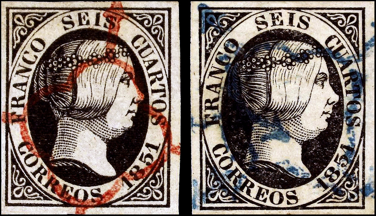
6 cuartos genuine characteristics
1. A & R are joined
2. There is a small line to the right of the nostril, this is almost a
secret trait but difficult to see on many examples.
3. The right serif of the 1 has an upwards curve
4. The serif is long and ends in a small blob.
5. End is joined
6. Break in hair line
7. Hairs don’t extend to the rosette
8. The inner middle 3 pearls have a crescent shading
NOTE this sample has a plate error behind the neck at the top
This issue has been completely plated so positions are easily identified.
The stamps below are positions 4, 23, 28

Below is an essay these come up on auctions with the typical obliteration shown

Forgeries
NOTE - The genuine is always on the left

Forgery from unknown source
Nose is very pointed
Eye is larger
The 8 & 5 of 1851 is larger
The letters in CORREOS are wider as are those in SEIS & CUARTOS

Another unknown source
Crude design
Letters and numerals are too large and many touch the frame
Heavy eye shading and pointed nose

Another unknown source
Crude design
All the letters and numerals are distorted
The diadem rosettes are incomplete

The letters and outer frame are too thick
The eye, nose and mouth are heavily shaded
The eye, nose and mouth are heavily shaded


A deceptive forgery from an unknown source
The nose is pointed
The O in CORREOS is large
Thick frame line

A fair forgery - the "stern queen"
The eye, nose and mouth are the wrong shape
The O in CORREOS is narrow and tall

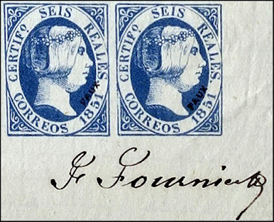
Fournier forgery
The AN of FRANCO is not joined
The top left ornament is thick
The letters are shorter
The word CUARTOS is placed higher
The E of SEIS is almost vertical
 |
| From the Geneva Fournier Collection |

Nose comes to a point
Back of the neck is not a solid line
The top of the E in SEIS is slanted differently
Thick hair lines
The center pearl of the left rosette has a half moon dash instead of a large black dot

The curve of the nose is different
The shape of the rosettes is wrong
The corner elements are distorted
The line of the nostril carries into the lip
Many letters are too thin

Bobes forgery
Very little is known of this forger but he was very prolific
His forgeries are not very good and he produced many of them in different colors
Here the letters are generally too thin and tall
The O of CORREOS is slanted
The eye is wrong

A very crude forgery from an unknown source
The cancel is sometimes seen on Torres creations
All the letters and features are wrong

The eye, nose and mouth features are simple
The letters in SEIS are notably wrong
The diadem florets are much too small

Queen has a stern look
Many crude letters
Corner ornaments are thick

Graus Type VII forgery
Forgery in dark blue instead of blackOverall very rough printing

Type VIII forgery
Thin frame lines
Thin small letters
Bulbous nose
No center crescents in the pearls
Thin small letters
Bulbous nose
No center crescents in the pearls
Outer frame line not in original

Possibly modern.

Top serif of I of SEIS is noticeably curved
 Fair forgery
The 1 of 1851 has no serif
Corner ornaments are thick

the I in SEIS has almost no top serif
The tops of the EO of CORREOS are broken

The RES of CORREOS are oddly shaped
The 1 of 1851 touches the frame
The eye is heavily shaded

The I of SEIS is inclined to the right
The rosettes are very large
The far left set of pearls has dashes instead of dots
The first 1 of 1851 has a thick base and very small serif
Letters are inconsistent

12 Cuartos Genuine stamp
Forgeries

Printed by typography on thin white paper. It is also found on paper of brown color hue
1 “DO” letters larger than “CE”
2 The nostril and the corners of the mouth are formed by thick and short lines.
3 The base of the second “1” is short on the right.
4 The thick line of separation between the neck and the base of the bust is open at the back.
5 The shadow of the center pearl of the rear set is an arc instead of a point.

Bobes forgery
Printed by lithography on thin gray paper.
1 The eye especially the eyebrow is very different
2 Absence of the far left section of the hair on the neck.
3 Letters “EOS” of CORREOS very disproportionate.

Fournier forgery
Printed by lithography on thin white paper. For
identification
1 Letter E from DOCE hangs down.
2 Large break in the thick curved line of the head.
3 Defective finishing of the hair band
4 Two of the vertical lines of the neck are incomplete.
 |
| Geneva Fournier Collection |

Spiro forgery
Printed by lithography on thick white paper.
1 The S of CORREOS is inclined to the left.
2 The first set of beads of the crown formed by four well distinguishable, the central one almost absent.
3 The adornments of the four corners are very deformed.
4 First “1” high.
5. The 5 has a very short top
6. The letters are uneven.

Graus Type II
Printed by lithography
1 Letter ‘O’ of DOCE tilted to the right and ‘C’ large.
2 The eye is topped by two lines that protrude to the right and down
3 Figure ‘5’ with short head.
4 Letter ‘A’ of CUARTOS is narrow.
5 The last set of pearls of the headband is a reportable mass of spots and stripes.

Graus Type III
Printed by typography on thin gray paper.
1. D0CE has thick and short letters.
2. Thick shading lines in the hair
3. The top or the T is hook shaped
4. First 1 is misshapen and without a serif

Graus Type IV
Printed by lithography on thick yellow paper.
It is also known printed in blue.
1 . Letter D of DOCE is narrow.
2. Letter U with fine lines and slightly tilted to the right.
3. Letters RR joined by the base.
4. Small EOS letters.
5. Figure 5 with almost rectangular head.

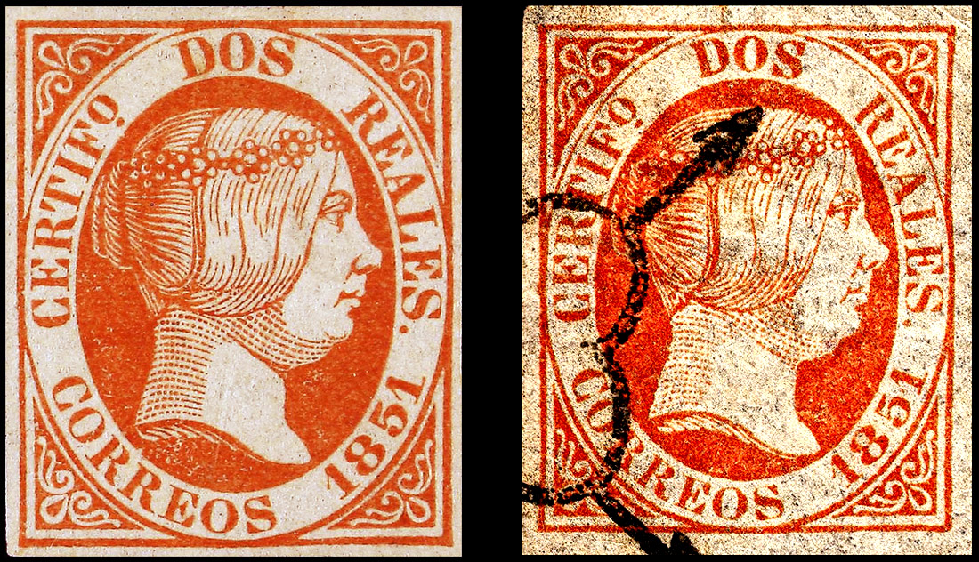
Dos Reales Genuine Stamp
Forgeries

Bobes Forgery in one of his 6 colors
1 The head of figure 8 is too wide.
2 The head of figure 5 has been thinned
3 The right base of the first 1 is short and thick.
4 The upper part of S of CORREOS is somewhat domed.
5 Second O of CORREOS is too thick in the left-bottom zone

Facsimile
Reproduction without fraudulent intent
The engravings of this work are proportional with the originals
1 Small DOS
2 The R of REALES is offset
3 First digit of ‘1’ with short serif
4 Small ‘0’ very small
5 No point after REALES
6 AL not joined
7 Pointed nose
Fournier forgery
Printed by lithography on thin white paper.
Fournier made forgeries of varying quality so expect variations
This example would easily fool any collector on an auction site
1 The nose is more pointed and the nostril curves more upwards
2 Defective finishing of the band were it curves up
3 The pupil is more shaded
 |
| Signed purchase offer from the Geneva Collection |
 |
| Fournier 2R color error |

Novella forgery - there is scant information on this forger
Printed by typography on thin yellow paper.
Design is very well executed
1. Letter O of DOS is wide.
2. The head of the figure 5 is thin.
3. The right foot of the last 1 does not curve up
4. More of the shading dots in the neck are joined together
5. The trailing legs of the top left ornament are not joined together

Segui forgery
Printed by typography on white or yellowish paper, thin or medium.
1 Letter O is thick.
2 Second 1 without serif on the right.
3 Frontal lines of the band, thick and short.
4 The nostril is short and the eye is heavily shaded

Printed with thin yellow paper.
1. Wide spacing in 1851
2. Large O in DOS and thin S
3. S of CORREOS has a flat bottom
4. Heavy shading around the eye
Note the large unknown shape left of the the D of DOS

Printed with thin yellow paper.
1. Wide spacing in 1851
2. Large O in DOS and thin S
3. S of CORREOS has a flat bottom
4. Heavy shading around the eye

Graus Type I
Thick white paper
1 The back of the neck formed by points instead of stripes.
2 The small O of CERTFº open at the base.
3 No point after REALES.
4 Thin mouth and lack of nostril
5 Pointed nose

Graus Type III
Printed by lithography on thick yellow paper
1 Letter OS drops down.
2 S of REALES touches the frame
4 Second O of CORREOS is higher than other letters
5 The joint between chin and neck is a continuous line.

Graus Type V
Image from a catalog, actually orange.
1 The head of figure 8 is too wide.
2 The head of figure 5 has been thinned
3 The right base of the first 1 is short and thick.
4 The upper part of S of CORREOS is somewhat domed.
5 Second O of CORREOS is too thick in the left bottom area

Graus Type VII
Reproduction by photographic methods and lithography printing on gray medium paper.
A dangerous forgery
1 White dot above the head below the S.
2 Break in the top of the R of REALES
3 Only two points on the first line of shadow of the chin.
4 Break in the lower curve of the band’s thick line.
5 Letter E in CORREOS without a base on the left.
6 Break at the base of the small o

Printed by lithography on yellowish medium paper.
1. DOS subscription with very separate letters.
2. It lacks the point after REALES.
3. The design of the band is awkward.
4. The terminals of the ornaments of the four corners are circles.

Printed by lithography on thick white paper.
1 The word “DOS” offset to the left.
2 The first set of the diadem with only four beads.
3 The eye is heavily shaded.
4 The decorations of the four corners are very awkward
5. Letters and numbers do not match the original

This is very well done forgery that would easily pass as genuine
The corner elements are thinner
The letters are thicker

The 2 Reales was also printed by error in the very rare blue and several forgeries resulted
No forger information on this one
The central pearls in the diadem are too small
The letters and numerals are too thick
The shading lines are heavy

Novella forger
Very well done forgery
Ridge of the nose has a bump
Trailing of top left ornament is not joined

Heavy set eye
Thick shading lines
Last 1 has short bottom right foot
The shading lines are heavy

Overall somewhat crude
Large eye
Wide space between 1 and 8
Thick nose and mouth line

Cinco Reales genuine stamp
Forgeries

Bobes forgery in black
Printed by lithography on thin gray paper. It exists printed in the six colors that make up
the series.
1 Eye and eyebrow has a concerned look
2 Absence of the far left section of the hair on the neck.
3 letters “EOS” of “CORREOS” very large.
4 Very large margins

Fournier forgery
Print by typography on medium-white paper.
1 Wide “N” letter.
2 Large break in the thick curved line at the top of the head.
3 Defective completion of the four descending lines of the third zone of the band.
4 Two of the four hair lines at the nape of the neck are incomplete
 |
| Fournier partial sheet from the Geneva Collection |

Novella forgery
Printed by typography thin white paper.
Well done design that may well be one of the best forgeries that requires attention
1 Second ‘C’ slightly rounded.
2 The serif of the first ‘1’ is too short.
3 The fourth and fifth line of the upper part of the head with breaks in the central areas

Segui forgery
Printed by typography on thick or thin yellow and white paper.
1 The 1’s in 1851 have thick serifs
2 The second 1 has a short straight base
3 Absence of the oval of the cheekbone.
4 Hair lines are thick as are the neck shading dots
5 The nostril line is thick and short

Printed by lithograph on thick yellow paper.
Overall a very poor reproduction
1 The letters CINCO is shifted to the left.
2 Break in the oval on “O” of CINCO.
3 First right foot “R” touches the oval.

Torres forgery
Overall very poor reproduction
1 Peculiar design of the ornaments of the corners.
2 slightly aquiline nose.
3 Letter ‘S’ of CORREOS with a straight base.
4 First ‘1’ separated from the rest of the numbers.

Graus Type I
Printed by lithography on thick yellowish paper.
Very poor imitation.
1 Top of the 5 slopes down
2 The queen looks up.
3 The corner of the eye does not touch the line of the band
4 First “1” without base.
5 Dashes above CINCO
6 The second R of CORREOS is joined at the feet

Printed by lithograph on thin white paper.
Very poor overall
1 The central set consisting of eight beads.
2 The small eye with thick eyebrow.
3 The OS of CORREOS deformed
4 Letters RE joined at the base.

Printed by lithography on thick yellow or thin
white paper.
1 First ‘C is inclined to the left .
2 The eye has a cross shape below it.
3 Figure 5 has a short top
4 The last set of pearls without definition

Printed by lithography on thin yellowish paper.
1 Pointed nose.
2 Upper lip not well drawn
3 The shading of the neck and jowl formed by points too thin.
4 Base of the second OR of CORREOS oblate.
5 The shading of the nape is made up of five stripes instead of four.

6 Reales Genuine stamp
Forgeries

Printed by lithography on thin gray paper. It exists printed in the six colors that make up
the series.
1 Eye and eyebrow has a concerned look
2 Absence of the far left section of the hair on the neck.
3 letters “EOS” of “CORREOS” very large.

Facsimile
Reproduction without fraudulent intent
The engravings of this work are proportional with the originals
1 Small SEIS
2 The R of REALES is without serifs
3 First digit of ‘1’ with short serif
4 Small ‘0’ very small
5 No point after REALES
6 AL not joined
7 Pointed nose
8 Thin mouth and nostril

Novella forgery
Created by typography on thin yellow paper.
Apart from color, this would be a very dangerous forgery
1 The serif of the head of the 1 is coarsely attached to the body and the serif is slightly
short.
2 The left bottom corner element is too thin
3 The fourth and fifth lines of the upper area
of the head have large breaks.
4. Some of the central pearls of the florets are smaller

Segui forgery
Printed by typography on thin white paper. It exists on yellowish paper.
1 The inner shadow of the central pearl of the latter set is an arc instead of a point.
2 Nose and mouth lines are short.
3 The right base of the second 1 is short.
4 The first 1 serif line is short.
5 The frontal lines of the band are short and thick.

Printed by lithograph on thick paper.
Overall a very poor imitation
1 The terminal triangle of the base of E is very
large.
2 The base of the letter A is closed, resembling a triangle.
3 The figure 5 is closed in.
4 The right foot of the first R of CORREOS touches the oval.

Graus Type II
1 Except for the letter R of REALES, the others lack or have very small serifs
2 Second R of CORREOS is too open at the base.
3 R of CERTIF is lacking the serif.
4 The shadow line of the neck is very pronounced.

Graus Type III
Printed by lithography on thick paper
Overall very crude
1 Second S of SEIS touches the oval by the base.
2 Second O of CORREOS open at the base.
3 Error showing FRANCO instead of CERTIF.
Printed by lithography on thick paper
Overall very crude
1 Second S of SEIS touches the oval by the base.
2 Second O of CORREOS open at the base.
3 Error showing FRANCO instead of CERTIF.

Made by typography on thick white paper.
1 l of SEIS out of alignment.
2 The upper right triangle moved up. .
3 Figure 1has a very short base.
4 Protrusion in the neck

Printed by typography on thick white or yellow paper.
Very crude design.
1 Letters SEIS are crude
2 Figures 1 have short bases and serifs.
3 Small o is very deformed.
4 Florets are irregular shapes.

Graus Type VII
Printed by lithography on thick yellow or thin white paper.
1 Second S has the lower curve slightly closed.
2 The eye is topped by two lines that protrude to the right and down.
3 Number 5 has a short head.
5 The last set of pearls is lacking definition.

Graus Type VIII
Printed on thick or thin grayish paper
1 Letter I is very thin.
2 Missing point after REALES.
3 Figures 1 without bases.
4 Second O of CORREOS is very large.
5 Letters RR are very wide.
Printed on thick or thin grayish paper
1 Letter I is very thin.
2 Missing point after REALES.
3 Figures 1 without bases.
4 Second O of CORREOS is very large.
5 Letters RR are very wide.

Graus Type XI
Very dangerous forgery
May be a modern reproduction (Peter Winter??)
1 Break at the base of the first line of the band.
2 A of REALES with a slightly rounded head.
3 The central bead of the last set has the inner point too centered.
4 On this same set there is a well defined white point.

Graus Type XIII
Printed by lithography on medium paper.
1 Inscription SEIS with thin and tall letters.
2 Letters ES of REALES large and close to each other.
3 Thick heavily shaded hair band.

Graus Type XIV
Printed by typography on thick white paper.
A rather poor forgery
1. The eye made without detail and with thick lines.
2. The lobe of the nose is thick and pointed.
3. Large cleft in the chin
4. First 1 has a short serif and thick base.

1. Letters are too wide
2. The rosettes in the diadem are crude
3. Shading in the neck is made up of lines not dots
4. Several breaks in outer frame

A dangerous forgery
1. Eyelid heavier shading
1. Eyelid heavier shading
2. The right side of the O is thicker than the left
3. The area below the mouth is not as round
4. The foot of both 1's is thicker
 |
| Block from the Geneva Fournier Collection |
 |
| Fournier signed samples |

Torres forgery
1. Large space between the 1 and 8
2.The O of CORREOS is narrow
3. Very heavy shading overall
4. The eyelid is too large
5. Top left corner element is incomplete
6. The top of the 5 is different

Genuine Diez Reales
Forgeries

Bobes forgery in blue
Printed by lithography on thin gray paper. It is known in all colors of the original series.
1 The eye and eyebrow are different and more open
2 Pearls of the rosettes are malformed
3 EOS letters of CORREOS, disproportionate.
4 The first 1 has a short serif with the wrong angle.

came features as he previous

Fournier forgery
Printed by typography on medium or thin white paper.
1 Large break in the thick curved line of the hair above the rosette.
2 Two of the four hair lines at the nape of the neck are incomplete.
3 The ends of the top left ornament are not joined as in #5 of the genuine traits
4 Eye is more shaded

Novella forgery
Created by typography on thin paper.
Very dangerous forgery
1 Color point on the E of DIEZ.
2 The serif of the first 1 is short.
3 Top corner elements are thicker
4 The head of the 5 is slightly shorter

Segui forgery
Printed by typography on thin white or thick yellowish paper.
Overall very good and dangerous
1 The inner shadow of the central pearl of the last set is an arc instead of a point.
2 The nose and mouth end lines are short.
3 The right base of the second 1 is short as is the serif.
4 The frontal lines of shadow of the band are thick and short.
5 The right end of the bust is shaped differently

Printed by lithograph on thick yellow paper.
Very poor imitation
1 Letter E of DIEZ touches the top frame.
2 The base of the A is closed, resembling a triangle.
3 Figure 5 is closed ..
4 The right foot of the first R touches the oval.
Many other issues with the design and letters
NOTE - The following two are also classified as Spiro but there are differences
The cancels indicate they may be ones he made for others or they have a Torres connection


Graus Type I
1 Immediately recognized by FRANCO instead of CERTIF
2 Facial features very crude
3 All the letters too tall

Graus Type IV
Printed by lithography on thick yellow or thin white paper.
1 Center line of the E of DIEZ moved upwards and the base of the Z extends too far.
2 The eye is topped by two lines that protrude to the right and down.
3 Number 5 has a short head.
4 The last set of pearls has poor definition.

Graus Type V
Printed by lithography from a photograph.
Overall very good
1 The right bead of the first set is deformed.
2 Color point on top of the second E.
3 The eye is heavily shaded
4 Protuberance in the back of the second R of CORREOS.
5 The numbers are slightly thicker
6 More dots in the neck are joined

Graus Type VII
Printed by typography on thick paper
1. The corner elements are thick and lines touch the frame
2. The top of the E of DIEZ is inclined.
3. The hair lines are irregular.
4. The right foot of the second R is elongated.
5. Second O slightly displaced downwards

Graus Type IX
Printed by typography on thin gray paper.
Crude design overall
1. The centers of the large pearls lack dots
2. Neck shading is lines instead of dots
3. Large letters RE of CORREOS.
4. 1861 has thin and tall figures.
No comments:
Post a Comment
THANK YOU for the feedback. Your comment will be reviewed and appear on this blog within 24 hours
Do you have any pic to share? Use this code [img]your-image-url-here[/img]