
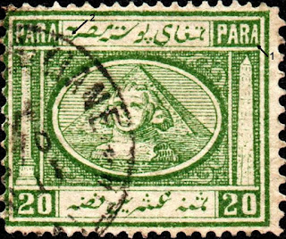
1867, August 1
 |
| Penasson Essay |
Perforated 15 x 12.5 with pseudo-watermark Crescent and Star
Designed by F. Hoff of Hirschberg, Silesia, Germany.
These stamps were valid until February 1,1872.
Die proofs (all values) & color trials (5pa, 20pa, 1pi)
This is the first pictorial issue of Egypt, depicting some of the famous characteristics of the country, namely the pyramid and sphinx in the centre, the needle of Cleopatra at right and the column of Pompey at left.
It is also the first issue of Egypt on which the inscriptions appeared in Arabic letters.
The paper used for printing this issue is of an inferior quality and is easily damaged.
A pseudo watermark, of a Crescent with Star above, was produced on the sheets, after they had been printed.
It was impressed on the paper in low relief, a method which encouraged forgers to counterfeit them. The forged watermark, being coarser and deeper than the genuine, can be easily detected.
Original Stamps
Stamps of this issue were engraved four times (2 x 2) for each value and the resulting block was used. to form the entire sheet.
Consequently, any block of 4 comprises four different types. These differences are small, but they do add additional information on genuine issues.
 |
| 1867 Essay |
The following describes the genuine features.

1) The "P" of PARA in the top right corner has a larger head than that in the opposite corner.
2) The second dot from left in the lower label does not touch the frame line above.
3) The second Arabic letter from left in the upper label crosses the frame line underneath. In the other types it only touches it.

1. The second "A" of PARA in the top left corner is thinner.
2. Of the three dots over the first Arabic word from right in the upper label, the first one from left is lower than the other two.
3. The second dot from left in the lower label almost touches the frame line above.

2. The "5" in the lower left corner is smaller than those of the other types and tends towards left.

1. The second "A" of PARA in the top right corner is thinner.
2. Both figures "5" are higher up and give a wide clearance between their base and the inner frame line.

1. Of the three dots on the first word from right in the upper label, the first one from left is above the level of the others.
2. The figures "I" in the lower corners are thinner.
3. The summit of the pyramid touches the oval frame line above.

1. The dot after in the bottom panel is missing. In types I and III this dot occurs.
2. The horizontal line to the first "A" of PAHA in top right corner is almost absent or very faint.
3. The "O" of figure "10" in the lower left corner is misshapen, the enclosed central part having a slight projection
4. The "0" of figure "10" in the lower right corner is very wide and square at the bottom.
5. The second "A" of PARA in the top right corner is larger than those of the other types.

1. Of the three dots on the first word from right in the upper label, the first one from left is lower than the other two.
2. The two figures "l" in the lower label arc fatter than in Type I.
3. The summit of the pyramid does not touch the oval frame line above.

1. As in Type II, the dot in the bottom panel is missing.
2. The second "A" of PARA in the top left corner is very thin

1. The shaft of the Ionian column is centered to the left in relation to its capital and base.
2. The second dot from left in the lower label touches the frame line above. This does not occur on the other types.

1. The two numerals "2" of "20" are thin and tend towards left.
2. The letters "'P" and "A" of PARA in the top right corner are widely spaced.
3. The three dots over the first character fron1 right in the lower label are situated further to the left than those on the other types.
3. The summit of the pyramid does not touch the oval frame line above as in other types.
1. The second "A" of PARA in the top right corner is nanow and squeezed into position.
2. The second dot from left in the upper label is closer to the sloping downward character than in any other type.

1. Small white dot just at the left of the curved portion of figure "2" of the right-hand "20".
2. The front foot of letter "R" in the upper left corner is thick, and broken off at its top.
3. The letter in the upper label does not touch the frame line underneath as in the other types

1. The obelisk is almost well centered in its frame.
2. The Arabic letter at the left in the lower label is more distant of the preceding letter than in the other types.
3. The two sides of the base of pyramid do not touch the oval frame line, and are at equal distance from it.

1. The obelisk is very large at the base and centered to the left.
2. The Ionian column is centered to the right.
3. The sharp right-hand part of letter in the middle of the lower label almost touches the frame line above.

1. The obelisk is centered to left.
2. The Arabic letter in the lower label is larger than the other types, and the dot over, almost touches it.
3. Of the three dots over the first word from right 1n the upper label, the first from left is above the level of the other two.
4. The first dot from the left in the upper label touches the vertical frame line.

1. The obelisk is centered to the left, but it is not so large as that of the Type II.
2. The three dots over the first word from the right in the upper label are on the same level and equally spaced.
3. The sloping downward Arabic letter at the left in the upper label touches the frame line underneath. This doe3 not occur on the other types.
4. The right-hand base line of the pyramid does not touch the oval frame line.

1. The obelisk is larger and shorter than the others.
2. The white oval frame shows a coloured nick below the Sphinx base

1. The letter "P" in the top left corner is centered to the right.
2. The shaded far side of the pyramid at the right is narrower than in Types I and III.
3. The base of the Ionian column is shorter than the others.
4. The right-hand word in lower label slopes down and to the left.

1. The left-hand base of the pyramid is farther away from the oval frame line than in the other types.
2. The base of obelisk is narrower than in the other types.
3. The topmost hieroglyphical inscription on the obelisk has a horizontal line across.
4. The white oval widens appreciably below the Sphinx.

1. The shaded far side of the pyramid at the right is almost as narrow as that of type II.
2. The summit of the pyramid does not touch the oval frame line above, while it does on the other types.
3. The two base lines of the pyran1id are at equal distance from the oval frame line.
4. The first Arabic letter from the left in the lower label rests upon the inner frame line.
5. The right-hand word in the lower label lies nearly parallel with the frame line below.

1. Of the three dots on the first word from the right in the upper label, the one at left is above and that at right is below the level of the central dot.
2. The Arabic sloping downward letter at the left in the upper label touches the fra1ne line below. In the other types it does not.
3. The first character from the left in the lower label nearly touches the frame line below.

1. The top dot of the triangle of three over the first character from the left in the lower label touches the fran1e line above.
2. The dot over the central character in the bottom panel touches the frame line above.

1. The figure "5" in the lower right corner is thinner than those of the other types.
2. The first character from the left in the lower label, almost touches the frame line below.
I do not have a sample of the 4th type
1. The coloured oval band is more spaced at the right and at the bottom from the straight frame lines than in the other type9.
2. The coloured background at the righ hand side of figure "5" in the lower right corner is considerably larger than in the opposite corner.
Forgeries
Fournier sold many of these issues and later ones including the postage dues
 |
| Fournier Imperf |
The tops of the 5's are too short
The ends of the pyramid base extend too far into the oval
The last bottom word lacks the 3 dots above it
The mid letter has 4 dots above instead of 3


Fournier Trial color prints?
 |
| Very primitive forgeries |
Letters and numerals are poorly designed
Shading in the pyramids consists of dots instead of lines
 |
| Torres forgeries |
No comments:
Post a Comment
THANK YOU for the feedback. Your comment will be reviewed and appear on this blog within 24 hours
Do you have any pic to share? Use this code [img]your-image-url-here[/img]