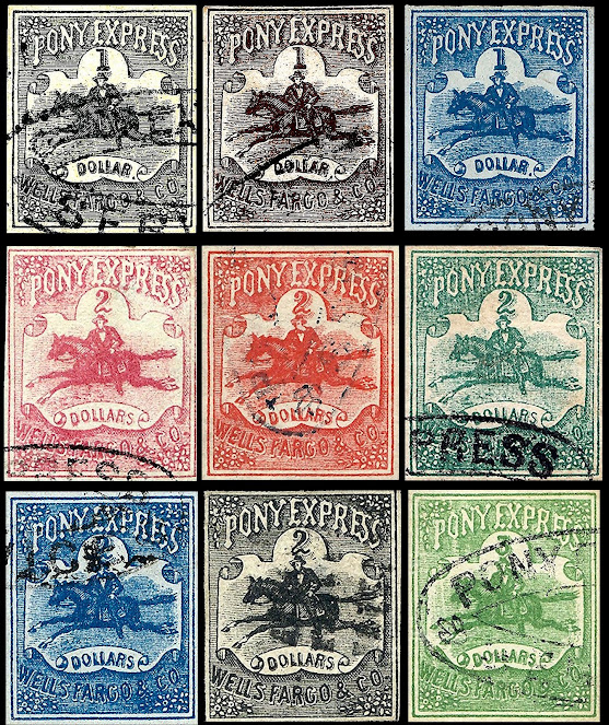
This post was established by Henry Wells and William Fargo on July 1, 1852.
In April 1861 they issued the $2 Red and $4 Green stamps as part of the Trans-Continental Pony Express.
On August 11, 1862 Wells Fargo established the Virginia City Pony Express to serve the mining towns of Nevada and they issued the "CENTS" values. The $1 Red, $2 Green, $4 Black and the shield designs were issued about July 1, 1861 when the rates were cut in half.
 |
| WELLS FARGO STAGECOACH IN PESCADERO, CALIFORNIA, 1890 |
The Original Issues
Sc 143 L1 & L21862-54 Virginia Epress Originals
Sc 143L7The Reprints, Bogus, Facsimiles and Forgeries
The Facsimiles
These are modern facsimiles, printed in sheets of ten, in a multitude of colors.
The design of the stamp is very crude, with "WELLS, FARGO & CO." almost unreadable.
Eight of the ten positions have "Facsimile" printed on the back of the stamp.The original source is unknown.
Here is an original sheet
The Reprints
The reprints were made from a new stone in 1897.
Apparently, the company president requested copies to provide family members with the stamps and extras for trades.
It appears many more were produced and ended up with stamp dealers.
They are quite common and somewhat dangerous.
There are many differences with the original, the 3 main ones are:
-The horse's mouth is wide open
-There are no lines of breath from the horse's nostrils.
-The right fore foot is separated in all the reprints
Replicas
The main feature of these are the denser shading lines and thicker bottom letters. The source is unknown but probably modern.
The Forgeries
First is the very commom forgery attributed to Taylor.
The only problem is that Taylor generally did not cancel his stamps and the color scheme does not match his usual forgeries.
The only problem is that Taylor generally did not cancel his stamps and the color scheme does not match his usual forgeries.
Note the only Bogus non existent $3 value
The next 4 have a 3 pronged tail, a very odd shaped horse head and thin bottom letters.
The next one has traits of the above but letters are thicker.
The head is crudely drawn
The corner elements are very different.
This next one the lines around the bottom are horizontal and not cross hatched.
This is one of the better forgeries
This next one is extremely crude in all repects
The letters are thick and almost illegible
The next one the letters are all heavily shaded
The horse head is too small
The hat brim is too inclined
The next 2 are similar to the above but letters are less shaded
The next 2 are from the same forger.
No cross hatching in background
Odd hat on rider
Very thin bottom letters
In the next one
The lettes are all too thin
Horse head badly reproduced
The hat is too white
No cross-hatching in background
The following 2 are from the same forger
Bottom letters too thin Notr the odd looking "RG"
The following has no shading around the top letters
Hat, horse head & tail are wrong
Wrong horse head, hat and 3 prong tail
Bottom letters too thin
Backgound ia a mis of lines
The next one is a stamp album cut out
This next one is a crude forgery
The next one was produced for the Shadyside Fall Festival. Dated September 1936
The next one was produced for the Shadyside Fall Festival. Dated September 1936
The CENTS forgeries
These do not appear to be plentiful like the dollar ones
The first is noticeably quite rough
Note the vert high tail
This next one is classified as a replica?
The printing is better than the previous one bot still much heavier than the originals
This next one has very similar forgeries in the dollar ones
Rider with slanted hat and horse with spiked tail
I imaging the 10c also exists
The final one is from a 1935 hobby show and is quite good


Thanks for your great article. I have 4 obvious facsimile pony express stamps (3 of them have the print facsimile on the back of these mint stamps with large margins on one or two sides of each one. They are fun stamps, given that the real deal would probably cost me a fortune. I would love to find out if such fasimile ponies have any value. Any comments are very welcome. Thanks in Advance.
ReplyDeleteIf modern and stating "facsimile" then very little if any value.
Delete