
Miguel Segui was a stamp forger of Barcelona.
He produced forgeries of Spain and all its colonies in 1905 through 1930.
His forgeries tend to be quite deceptive and can still be found online due to the large quantities produced.
Most of his forgeries are uncancelled and can be found in blocks.
Very little is known of his production means or who printed them.
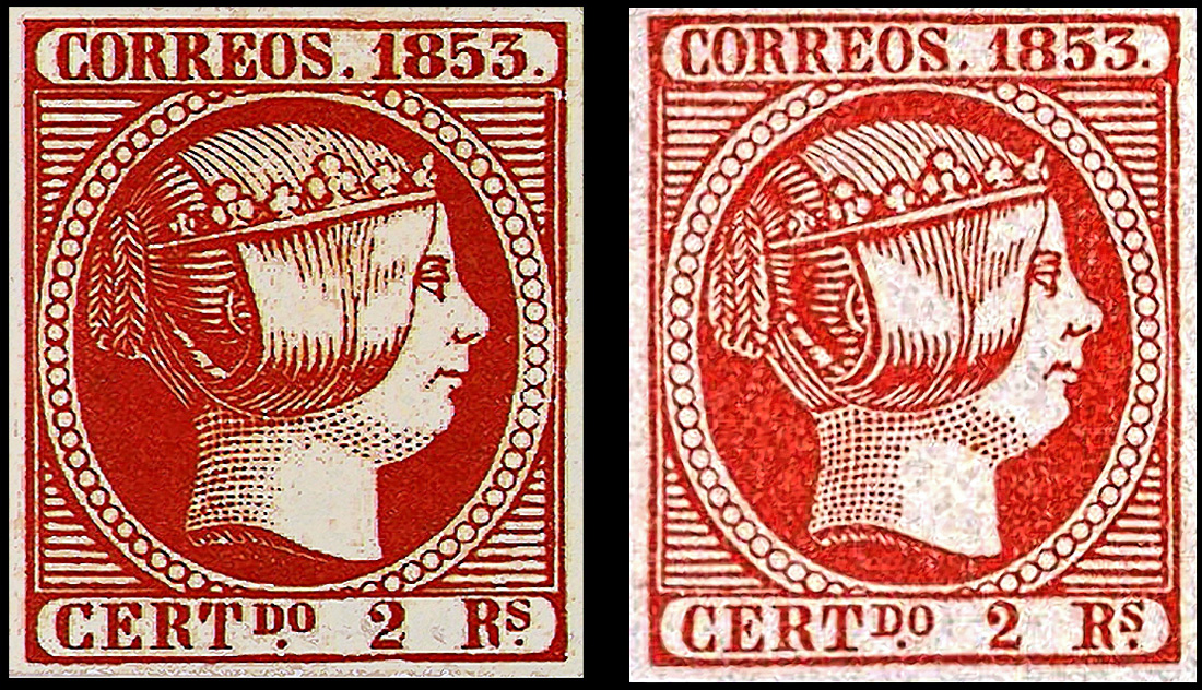
These are his forgeries (right) compared to originals (left)
1850

Ed 1
An excellent forgeryLetters tend to lack larger serifs of the original.

Printed by typography on thick paper.
1. The crown has several differences
2. The shading lines in the hair are thicker and more pronounced
3 The eye does not have an ellipse underneath.
4 The neck is outlined by a well defined line, whereas in the original it is formed by the grid of the background
5. The ornament to the left of 1850 has 3 spurs on its left side instead of 2


1. Large space between frames
2. Heavy shaded eyebrow
3. Mouth line is thick and does not curve as much
4. Corner element misshapen
5. No bump on the 8.
6. More white space and broken lines in the hair
2. Heavy shaded eyebrow
3. Mouth line is thick and does not curve as much
4. Corner element misshapen
5. No bump on the 8.
6. More white space and broken lines in the hair


Note the small dot of color in the eye
The back neckline is solid
The dash connecting the frame lines is missing
The hair lines are coarser
The tip of the crown comes to a point
Most Segui forgeries are found without cancels
The back neckline is solid
The dash connecting the frame lines is missing
The hair lines are coarser
The tip of the crown comes to a point
Most Segui forgeries are found without cancels

1. The corner breaks are missing
2. The A has a slanted middle bar
3. The S is larger
4. The hair lines are coarser
5. A break in the frame
6. The nose is more pointed
 Ed 6
Ed 6
2. The A has a slanted middle bar
3. The S is larger
4. The hair lines are coarser
5. A break in the frame
6. The nose is more pointed
1851

Nose comes to a point
Back of the neck is not a solid line
The top of the E in SEIS is slanted differently
Thick hair lines
The center pearl of the left rosette has a half moon dash instead of a large black dot

Printed by typography on thin white paper. It is also found on paper of brown color hue
1 “DO” letters larger than “CE”
2 The nostril and the corners of the mouth are formed by thick and short lines.
3 The base of the second “1” is short on the right.
4 The thick line of separation between the neck and the base of the bust is open at the back.
5 The shadow of the center pearl of the rear set is an arc instead of a point.

Printed by typography on white or yellowish paper, thin or medium.
1 Letter O is thick.
2 Second 1 without serif on the right.
3 Frontal lines of the band, thick and short.
4 The nostril is short and the eye is heavily shaded

Segui forgery of rare color error
Heavy set eye
Thick shading lines
Last 1 has short bottom right foot
The shading lines are heavy

Printed by typography on thick or thin yellow and white paper.
1 The 1’s in 1851 have thick serifs
2 The second 1 has a short straight base
3 Absence of the oval of the cheekbone.
4 Hair lines are thick as are the neck shading dots
5 The nostril line is thick and short

Printed by typography on thin white paper. It exists on yellowish paper.
1 The inner shadow of the central pearl of the latter set is an arc instead of a point.
2 Nose and mouth lines are short.
3 The right base of the second 1 is short.
4 The first 1 serif line is short.
5 The frontal lines of the band are short and thick.

Printed by typography on thin white or thick yellowish paper.
Overall very good and dangerous
1 The inner shadow of the central pearl of the last set is an arc instead of a point.
2 The nose and mouth end lines are short.
3 The right base of the second 1 is short as is the serif.
4 The frontal lines of shadow of the band are thick and short.
5 The right end of the bust is shaped differently
1852

Printed by typography on thick or thin yellowish paper.
1 The four lines inside the band that crowns the head are short on the left side.
2 Absence of shading on the eyelid.
3 The tip of the ribbon is small
4 The right side of the N is noticeably taller
1 The four lines inside the band that crowns the head are short on the left side.
2 Absence of shading on the eyelid.
3 The tip of the ribbon is small
4 The right side of the N is noticeably taller

Printed by typography on thick or thin yellowish paper.
1 The four lines inside the band that crowns the head are short on the left side.
2 Absence of shading on the eyelid.
3 The tip of the ribbon is small
4 The right side of the N is noticeably taller

Printed by typography on thick yellowish paper.
Block from the Geneva Fournier Collection
1 The four lines inside the band that crowns the head are short on the left side.
2 Absence of shading on the eyelid.
3 The tip of the ribbon is small and only has one layer

Printed by typography on thick yellowish paper.
1 The four lines inside the band that crowns the head are short on the left side.
2 Absence of shading on the eyelid.
3 The tip of the ribbon is small and only has one layer

Printed by typography on thick yellowish paper.
1 The four lines inside the band that crowns the head are short on the left side.
2 Absence of shading on the eyelid.
3 The tip of the ribbon is small and only has one layer
1853

Ed 17
Printed by typography on thick yellowish paper.
1 The four lines inside the band that crowns the head are short on the left side.
2 Absence of shading on the eyelid.
3 The tip of the ribbon is small and only has one layer

Printed by typography on thin white paper.
Well executed
1. Letter ‘S’ with the head slightly flattened.
2. The right side of the third flower, counting from the left, is closed.
3. The eyelid is narrow.
4. AN letters joined by the base.
5. The last whole pearl in the lower right area of the oval is large
Printed by typography on thin white paper.
Used Segui are not common so cancel may be a fake
1. Letter ‘S’ with the head slightly flattened.
2. The right side of the third flower, counting from the left, is closed.
3. The eyelid is narrow. ,
4. AN letters joined by the base.
5. The last whole pearl in the lower right area of the oval is large

Printed by typography on thin white paper.
1. Letter small s has the head slightly flattened and offset.
2. The right side of the third flower, counting from the left, is closed.
3. The eyelid is narrow. ,
4. The last whole pearl in the lower right area of the oval is large.
5. The C of CERT is wider at the bottom
1. Letter small s has the head slightly flattened and offset.
2. The right side of the third flower, counting from the left, is closed.
3. The eyelid is narrow. ,
4. The last whole pearl in the lower right area of the oval is large.
5. The C of CERT is wider at the bottom

Printed by typography on thin white paper.
1. Letter small s has the head slightly flattened and offset.
2. The right side of the third flower, counting from the left, is closed.
3. The eyelid is narrow.
4. The last whole pearl in the lower right area of the oval is large.
5. The C of CERT is wider at the bottom
1. Letter small s has the head slightly flattened and offset.
2. The right side of the third flower, counting from the left, is closed.
3. The eyelid is narrow.
4. The last whole pearl in the lower right area of the oval is large.
5. The C of CERT is wider at the bottom

Printed by typography on thin white paper.
1. The right crown diadem resembles a G .
2. The upper star is open above and below
3. The lower dots are close to the letters and too large.
4. The lower left tip of the second star is tilted downwards.
1. The right crown diadem resembles a G .
2. The upper star is open above and below
3. The lower dots are close to the letters and too large.
4. The lower left tip of the second star is tilted downwards.
1854

Printed by typography on thin yellowish paper.
1. The head of 5 not as curved and thicker.
2. There are breaks in the lower chain ornament
3. All the leaves are shorter
4. The crown of the top right lion is has short spikes
5. The 8 & 5 are shorter than the 1 & 4
6. The legs of the N are curved
1. The head of 5 not as curved and thicker.
2. There are breaks in the lower chain ornament
3. All the leaves are shorter
4. The crown of the top right lion is has short spikes
5. The 8 & 5 are shorter than the 1 & 4
6. The legs of the N are curved


Printed by typography on thin yellow paper.
1 Letters and numerals are too thick
2 The blade in the upper right corner is short and not curved.
3 Pearls in the crown are too small
4 Crowns on lions lack spikes
1 Letters and numerals are too thick
2 The blade in the upper right corner is short and not curved.
3 Pearls in the crown are too small
4 Crowns on lions lack spikes

Printed by typography on thin yellow paper.
1. The 1 is thick .
2. The head of 5 not as curved and thicker.
3. There are breaks in the lower chain ornament
4. The leaf blade in the upper right corner is short and not curved.
5. The cross is smaller.
6. The crown of the top right lion is different.
1. The 1 is thick .
2. The head of 5 not as curved and thicker.
3. There are breaks in the lower chain ornament
4. The leaf blade in the upper right corner is short and not curved.
5. The cross is smaller.
6. The crown of the top right lion is different.

Printed by typography on white or yellowish paper, medium or thin.
1. Second O of CORREOS is smaller than the other letters
2. The lower right pearl of the crown is open.
3. The crown of the upper lion is almost nonexistent.
4. The top left scroll is not broken
5. The right leg of the N is tilted
6. The central horizontal bar touches the frame
7. The white dots in the chain links are missing

Printed by typography on medium or thin white paper. A very good forgery
1. The four pearls of the corner ornaments are small.
2. Broken left scroll of the left set, as in originals which differentiates it from the Segui Type I
3. The 5 has a small head
4. There is no point in the third ring on the right.
5. The bottom line has no breakage.
6. The pearls in the crown are indistinct

Printed by typography on medium or thin white paper.
1. Broken top right of scroll left of the crown , as in genuine stamps. (Key difference with Segui Type II)
2. Numeral 5 head is short and thick. The bottom opening is wider.
3. There is no point in the third chain link on the right.
4. The bottom line has no breakage
1. Broken top right of scroll left of the crown , as in genuine stamps. (Key difference with Segui Type II)
2. Numeral 5 head is short and thick. The bottom opening is wider.
3. There is no point in the third chain link on the right.
4. The bottom line has no breakage

1. Numeral 5 has a large bottom opening
2. Top left scroll has no broken line
3. No breaks in the bottom thin line
4. The cupula of the upper right ornament is not broken
5. The NC of FRANCO is not taller than the other letters
1860
2. Top left scroll has no broken line
3. No breaks in the bottom thin line
4. The cupula of the upper right ornament is not broken
5. The NC of FRANCO is not taller than the other letters

Ed 52
Segui Type I
Thick bottom letters
Straight ribbon ends
Large pupil
Straight ribbon ends
Large pupil

Lots of broken lines in the background

Later Segui Issues To Follow...
No comments:
Post a Comment
THANK YOU for the feedback. Your comment will be reviewed and appear on this blog within 24 hours
Do you have any pic to share? Use this code [img]your-image-url-here[/img]