Bavaria was the first German State to adopt postage stamps to prepay mail. The first day of issue was November 1, 1849.
An ordinance of King Maximilian, dated June 5th, 1849, authorized the issue of postage stamps and fixed the rates of postage.
Local letters and printed matter were carried for 1 kreuzer, subject to certain limitations of weight; the rate on ordinary single letters (weighing not more than 1 loth or 1/3oz.) was fixed at 6kr for distances up to 12 German miles; while 6 kreuzer was the charge for carrying single letters for longer distances.
Postage stamps of these values were, therefore, prepared and, according to an elaborate “code of instructions” dated October 25th, 1849, these were to be placed on sale on November 1st following.
From that day on all matter sent by mail had to bear postage stamps, which, according to the edict of October 21, 1849, had to be affixed in the upper left corner of the letter.
The 1 Kreuzer BlackThe design and engraving was made by the engraver Seitz, who, was found out later, included the initial of his name (S) in the engraving. The printing was done in
simple typography by the University Press of Munich.
The printing itself was first done in sheets of 180 stamps, and later in sheets of 90 stamps.
The printing consisted of two issues: The first printing in deep black, and the second issue in gray black. This change in the color was made simply for the reason
that a black cancellation on a deep black stamp was hardly visible.
In the second edition, the cancellation was clearly visible on the lighter background.
In the manufacture of the second issue several damaged spots showed on the plate. These are clearly to be seen in the frame lines of the large figure of value “1.”
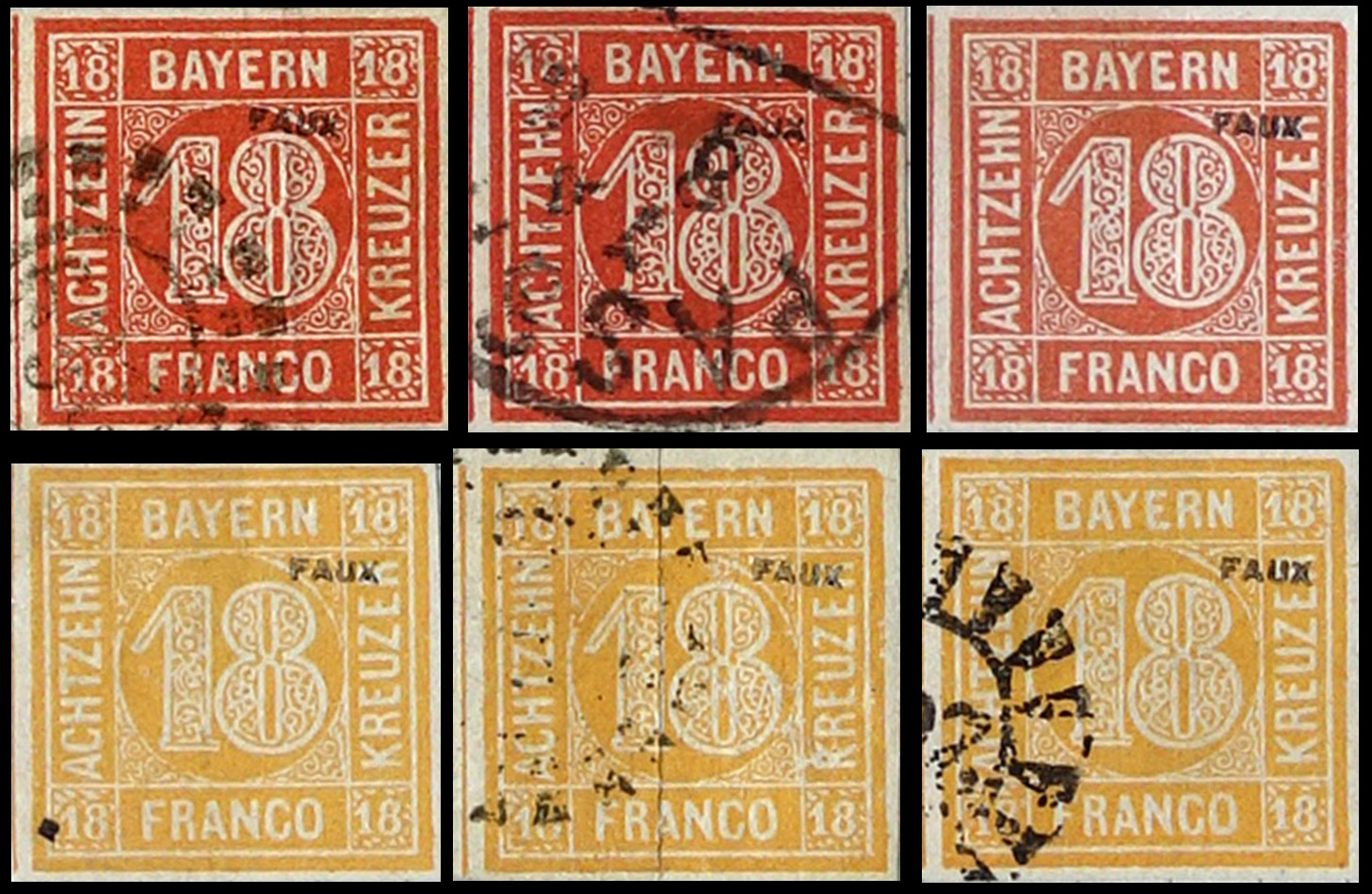
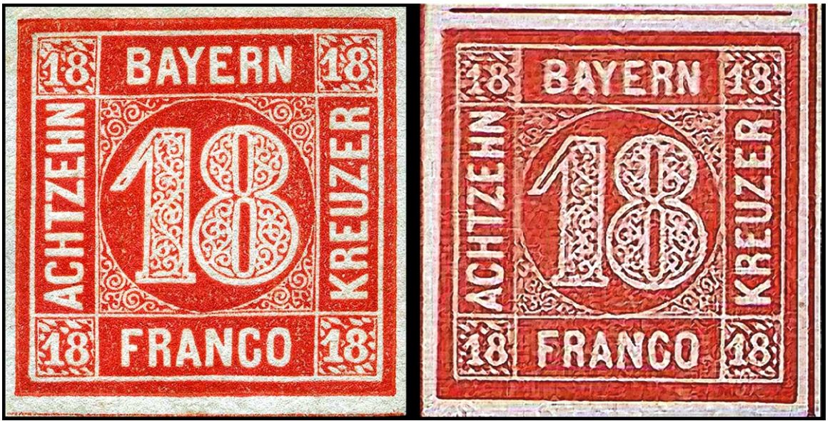
The rare 1 k black has been the target of most forgers (more than 25 different kinds of forgeries exist), but the 12 k and 18 k values were also forged.
Some time later in the following issues the Bavarian Postal-Department began to protect itself against forgeries by using a special paper into which a silk thread was introduced.
Later on, for still further protection, embossed printing, watermarks, etc. were added, which made it more difficult for the counterfeiters.
NOTE -
Stamps of Bavaria 1 Kreuzer, black, with silk thread are proofs from a single sheet, and do not exist in used condition. These are quite valuable.
Plate 1 & 2. The key difference is the lines around the “1” are less broken
Typographed.
Paper: white, medium to hard, hand-made.
1. Initials “fs” of engraver
2. White line thicker over “BA”
3. “W” shape
4. Point of “1” in middle of lozenge
5. Lozenge open at top
6. Middle stroke of this “E” is very short
7. M shaped item
8. Width 3.5 mm
9. Back of “K” slanted
10. “S” initial of Seitz
11. Corner open
12. Opening between 2 shapes
13. Crescent moon shaped item
14. Bottom stroke of “E” longer than others.
The bottom left ’1” is generally shaded in Plate 2 (see below) and sometimes has light shading in Plate 1
Forgeries
This stamp may well be the most forged item of any of the German States.
Given those listed and described in several of the prominent forgery catalogs, I would estimate that no less than 30 forgeries can be found.
Most forgeries are lithographed
Also the dark areas tend to be filled in black without the mottling of the genuine
A hand drawn sample rather well executed and then lithographed.
Aside from the short 1, poor rendition of KREUZER and the background, the fuzzy texture is evident when the image is enlarged.
Another hand drawn
The letters have no straight edges and are thick
There are dots in the corner 1's
The background of the 1 is completely different
- A decent forgery
- The E in EIN is too short
- Lots of black spaces in the 1
- The hidden letters are missing
- The top of the 1 is not inclined
- Both E’s in KREUZER are short
- Fournier second choice offered in his 1914 price list with 5 other values for 5 francs
- The background scrolls have many dark areas as do the corner numerals
- Overall, the letters are thinner than the original
Fournier choice1- Fournier First Choice, His best attempts offered for 6 Francs
- The hidden letters are wrong
- The N of EIN is curved
- The C of FRANCO has a bulge on top and the right side of the N is shorter
- The letters in KREUZER are uneven
Fournier Choice2

Fournier block from the Geneva collection
- Good forgery
- Corner diamonds different and larger
- Notch below top branch of top E
- Corner numerals are slightly larger
- 1 is too narrow
GPS T VIII- Hidden letters PH are missing.
- Very heavy outer frame lines
- All the E's have a large space before the lower leg
- Most of the background scrolls are missing
GPS Type IX - Good forgery
- Corner diamonds different and larger
- Notch below top branch of top E
- Corner numerals are slightly larger
A poorly executed forgery
- Most letters are distorted in particular the side E’s, the C & O
- Very thick outer frame lines
- The corner numerals do not match
- The hidden letters are missing
GPS Type VII - The hidden letter are missing.
- The letters CO of FRANCO are too flat on top.
- The top of the 1 is horizontal & not slanted
- The E’s are too short
GPS type XIII - Very crude design
- Flowery design inside the 1 with lots of black space
- All corner numerals have shading and backgrounds lacking any details
- Most letters are thinner
GPS Type XIII.2 - Typographcd on thin white paper
- Frequently found with a 159 millwheel cancel
- The frame lines are very irregular
- Letters are very thin and misshapen especially the R's
- All four comer numerals are partly filled in.
GPS TYPE XX - Very crude forgery
- Letters do not match, bottom ones inclined
- Coarse sparse background scrolls
- Short wide 1 with extended serif and lots of dark space inside
- The 1 is too tall
- The white space around the 1 is too wide
- The corner 1’s are too tall
- The background looks like a jigsaw puzzle
GPS Unknown 2 - Crude forgery
- Corner numerals do not match and large areas of black space
- All letters are very different, especially the E’s
- Background scrolls very different
GPS Unknown - The 1s in the corners too small
- Background scrolls very different
- Wide B in BAYERN
- Letters in FRANCO too thick
Photographic reproduction made in 1961.
-The dots of the photograph are clearly visible
Sperati Tete Beche
Sperati Type A- Excellent Sperati forgery Type A
- There is a white line between Y and E of BAYERN
- Dot between R & A of FRANCO
- These often have cancels PASSAU 20 8 2 F circular cancel and 382 and 297 millwheel cancels
Sperati Type B- Excellent Sperati forgery Type B
- C of FRANCO has a slight bulge on the bottom right
- Left E of EIN has a small bulge
Sperati Type C - Excellent Sperati forgery Type C
- There are several areas of concern shown below
-Although this forgery is reasonable, an extra thin outer frame line was added
- The 1 has little in inner details
- The background scrolling is sparse
- The letters in FRANCO taper to theright
Torres forgery - Very flowery design inside the 1
- Thin letters
- Hidden letters are all missing
- Corner numerals are narrow
Petr Winter Modern forgery
- Peter Winter modern forgery
- Hidden letters are missing
- Letters are generally thicker
- Background scrollwork is sparse
- Odd cancel
- Peter Winter modern forgery Type II
- Letters do not match in details
- All hidden letters are missing
- Fake cancel
- Background details lacking
Other Originals
Mi 2 Type i & II
Mi 3 Proof & label
Double safety thread - an odd occurrence
Forgeries
These are not prevalent
They tend to be the ones sold by Fournier as shown below
Bavaria fake cancels
Peter Winter Forgery- Overall very good and dangerous
- The corner scrolls are different
- The top of the 1 is inclined
- The diamonds in the corner numerals are different
- Several letters are misshapen
- This was advertised as a rare proof on a public auction but is more likely a forgery or bogus stamp
- The openings in the 8 are too narrow
- Most of the letters are too tall
- The T is curved
- The serif on the 1 is too short
- Possibly a Peter Winter modern forgery
- The numerals lack white spaces
- The corner numerals are different
- The space in the branches of the side F is larger
NOTE - many of these stamps were included in modern anniversary or commemorative postcards and private stamp shows. What is advertised might be a cutout from one such as this Menke-Huber postcard
 Peter Winter 1980's forgery
 Probably another Winter forgery with more shading and removed from a fake cover.
 Needs no explanation - very crude forgery


.jpg)


.jpg)